Most students commute, so they buy lunch near the department.
They wanted healthier, more varied options, and to spend less money.
Chiara Starcich Portfolio 2026 UX & Product Designer
Research-led design across physical and digital products, with a focus on health and wellbeing.

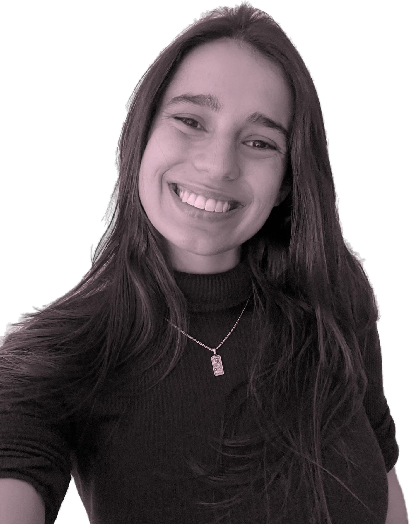
UX & Product Designer · Netherlands
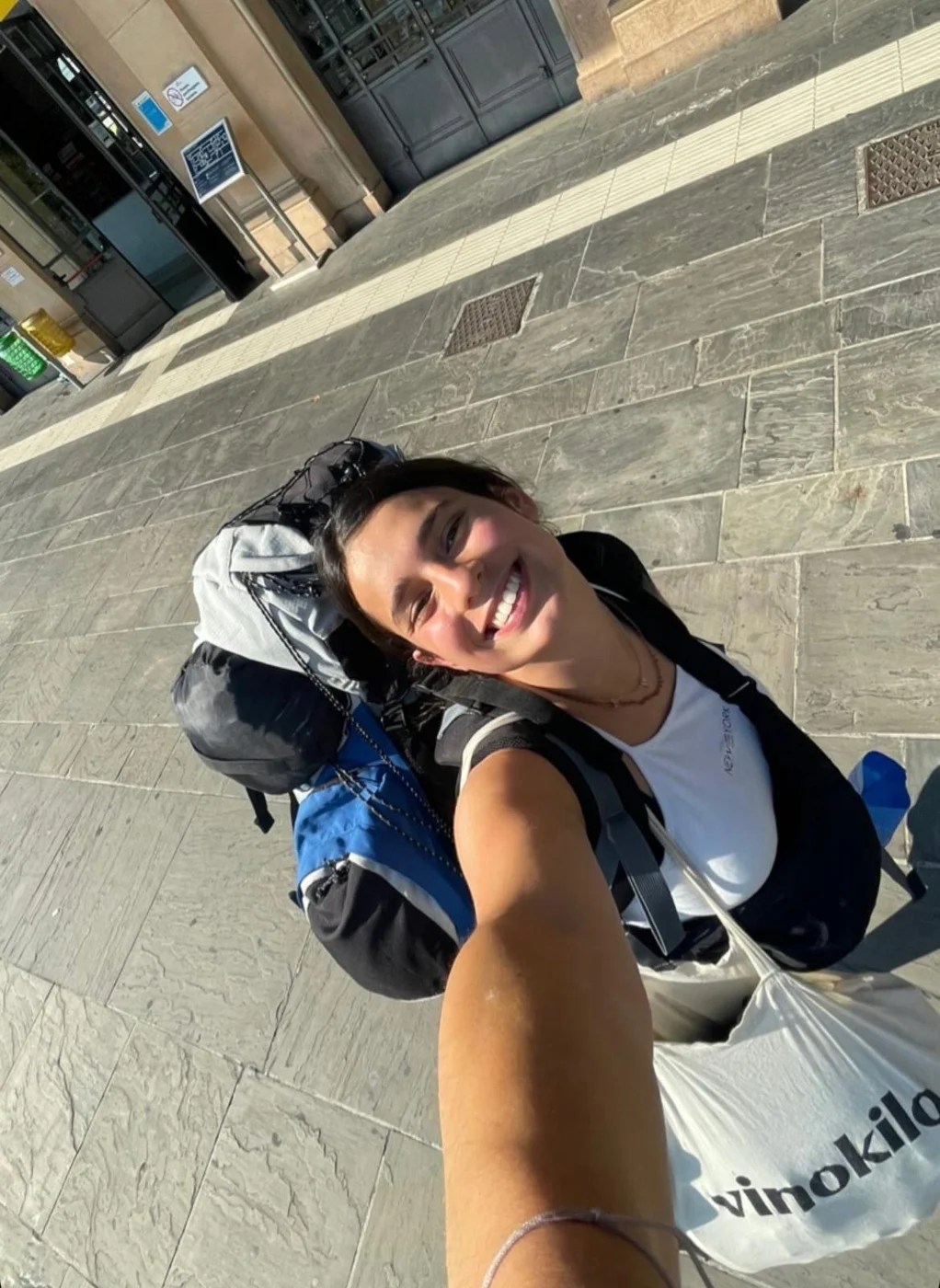
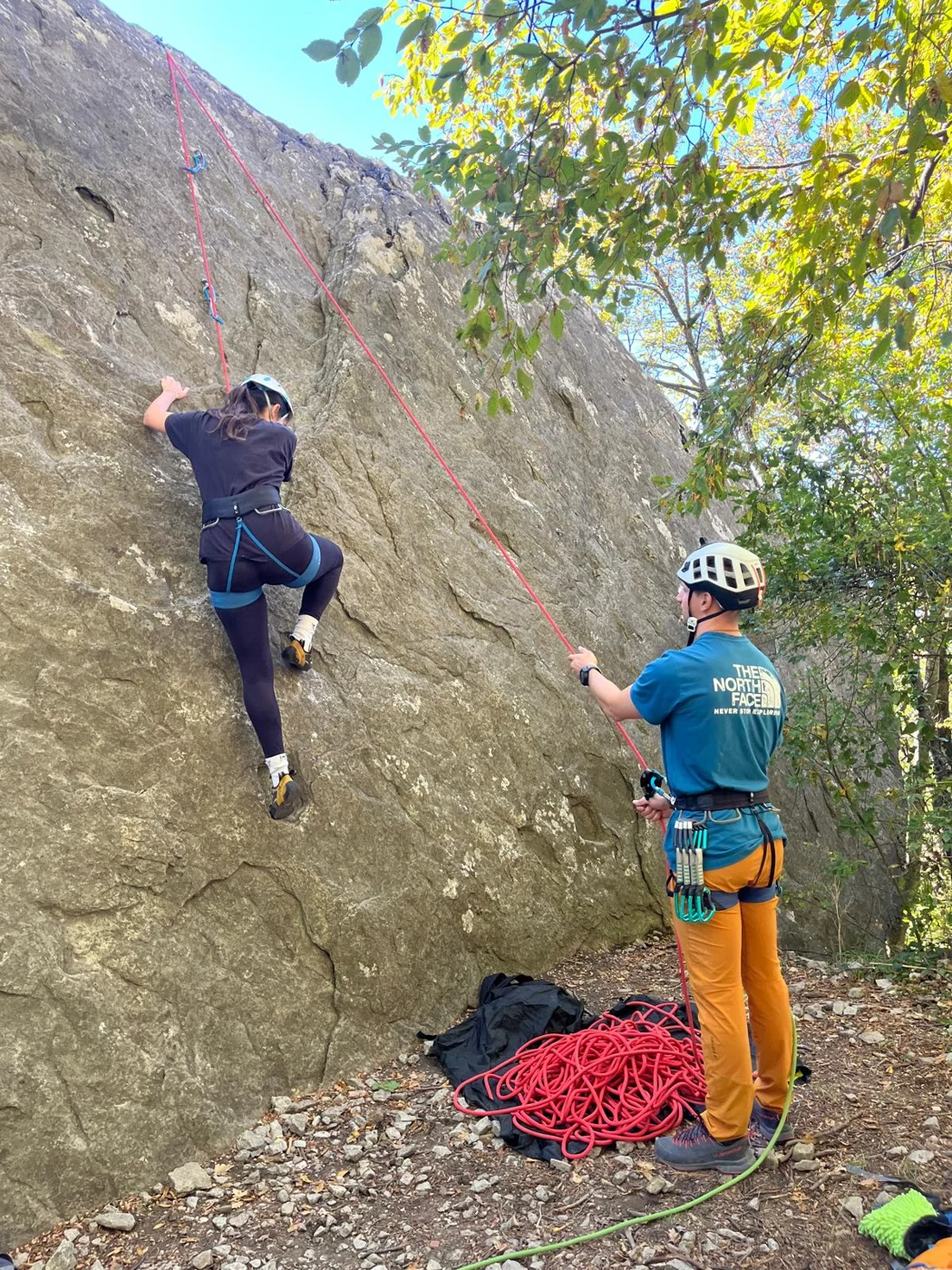
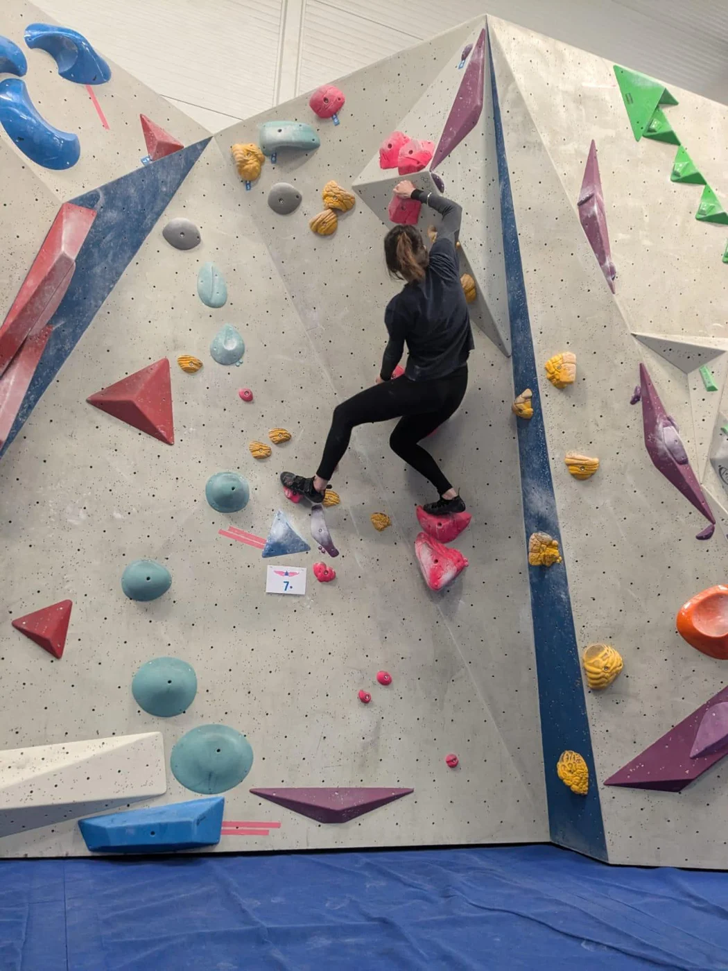
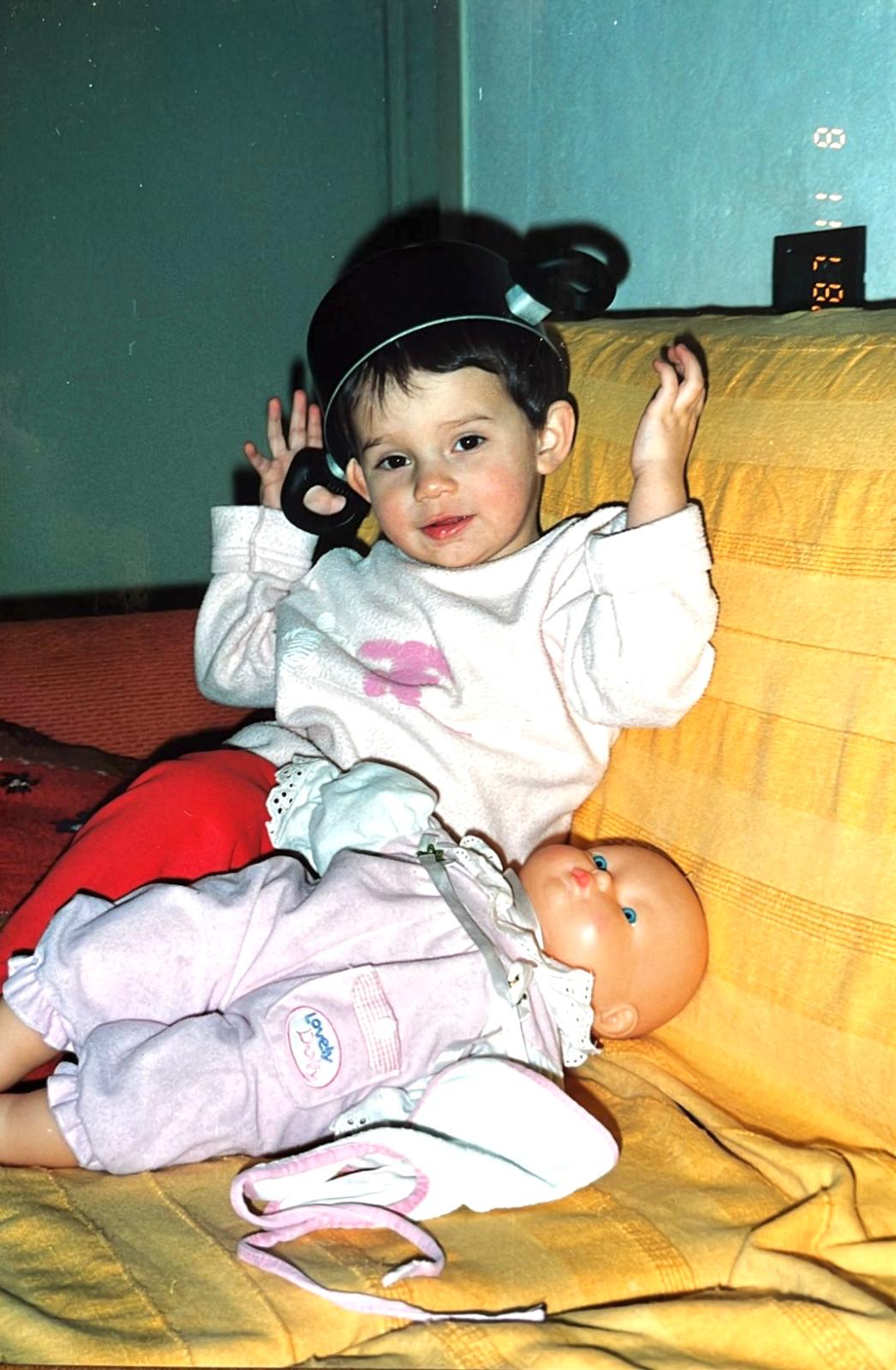
I design physical and digital products that people hold, wear and use every day. I start from research with the people who will use them, and I stay curious, as I was as a child: I explore, prototype and test early.
MSc Design for Interaction, TU Delft · BSc Industrial Product Design, Ferrara
Education, work, awards, collaborations and languages
2024 to 2026
TU Delft
2021 to 2024
Università di Ferrara
2016 · 2018
University College Dublin · Loughborough University
Feb to Aug 2026
Philips · I&D Usability Excellence, with UMC Utrecht & TU Delft
Solo project: designed a toolbox for studying how doctors rely on AI in clinical settings.
Sep to Nov 2025
Collins Aerospace
Ran comfort and usability studies for aircraft seats.
since 2023
Matteo Bazzicalupo · designer, co-founder of deepdesign Studio
3D modelling, renders, technical manuals and research. The only product designer on LIT, Life in Tiny, since 2023. Exhibited at Milan Design Week 2025.
Jul to Aug 2023
Studio Joanne Paul · Parma
Technical drawings, client meetings, material research.
2026
Honourable mention, Energy Buildings category · LIT, Life in Tiny
2025
Exhibition · LIT, Life in Tiny
2024
Exhibition
2024
Exhibition
2022
Exhibition
2026
Graduation project
2026
Graduation project
2025
MSc project · DOC
2025
MSc project
2025
MSc project
2022
Bachelor project
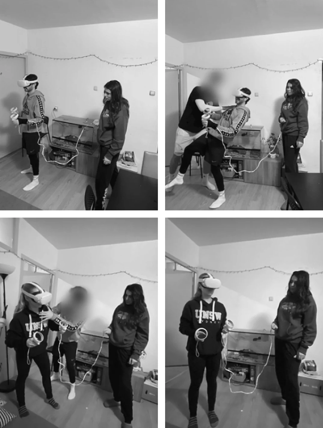
Physical prototypes, Wizard-of-Oz and VR test set-ups, Figma prototypes, user tests with children and adults
Interviews, observation, co-creation workshops, context mapping, surveys
Native
C1
IELTS 2024
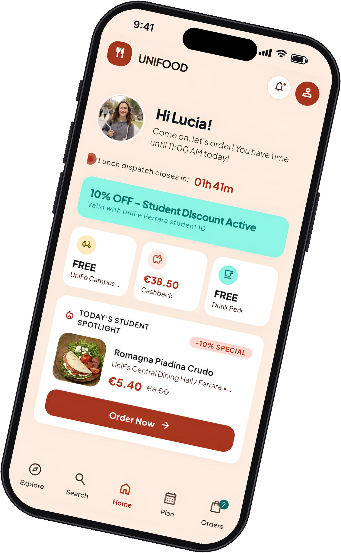
Lunch delivered to campus
Order lunch from the canteen, bakeries and delis, delivered by one rider to campus at 1 pm, with discounts that cut food waste.

In Ferrara, students of architecture and many other faculties have one hour for lunch, and the canteen is too far.
Team of 4, from research to a tested prototype. I designed the final UI.
A tested service and app with student discounts that also cut food waste: cheaper if you order in advance, or choose the day-before leftovers.
Most students commute, so they buy lunch near the department.
They wanted healthier, more varied options, and to spend less money.
Delivered to campus within the one-hour break.
Sellers’ leftovers from the day before sold at a student discount.
Order from the canteen, bakery, fruit shop or deli. One rider collects everything and delivers it to pickup points on campus at 1 pm.
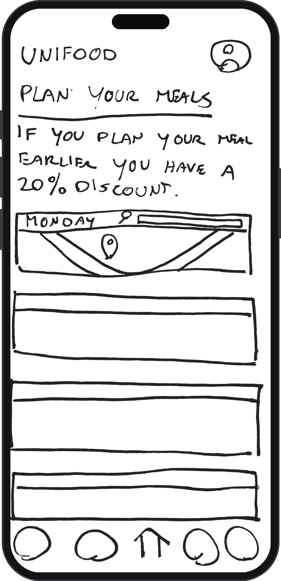
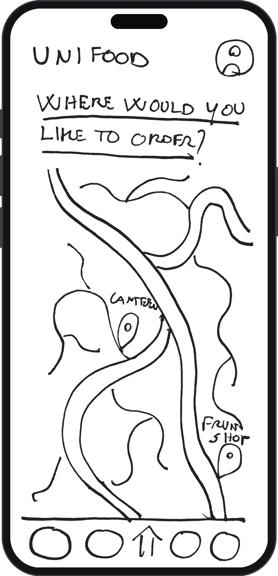
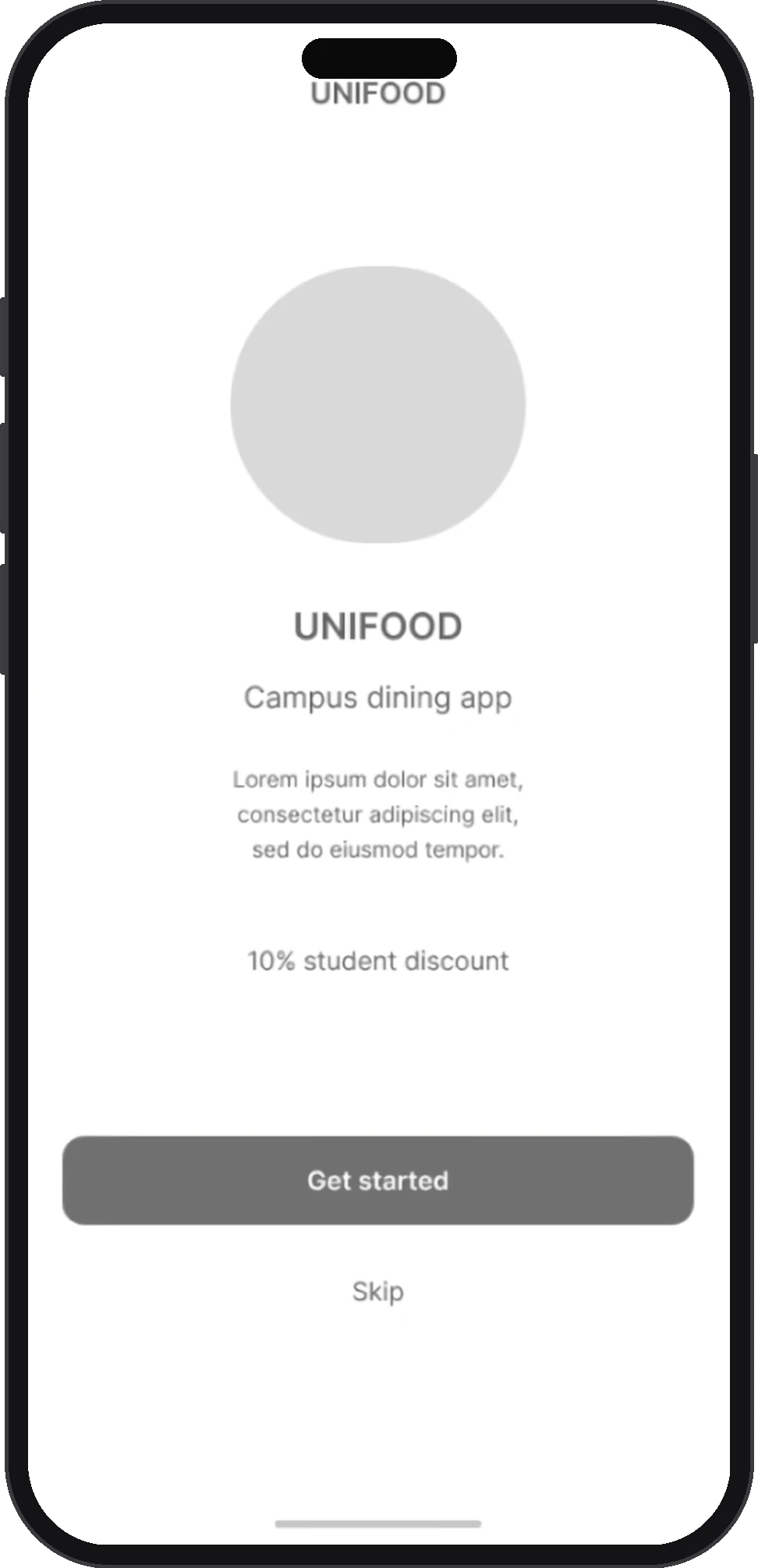
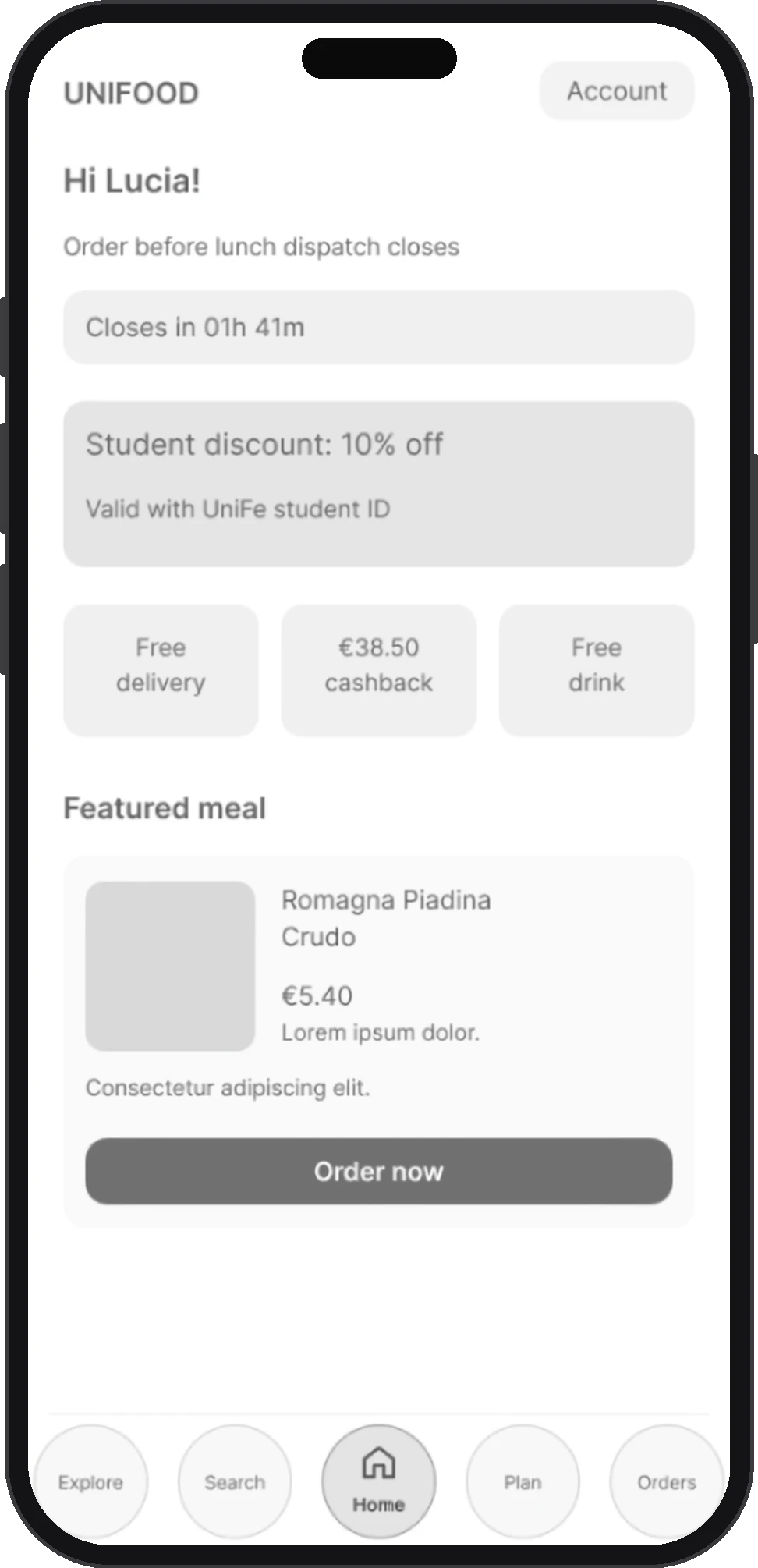
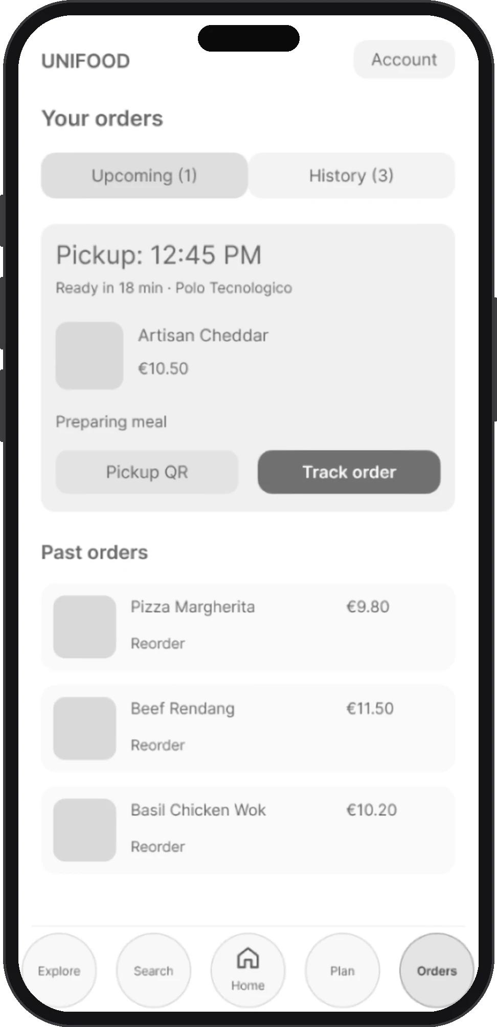
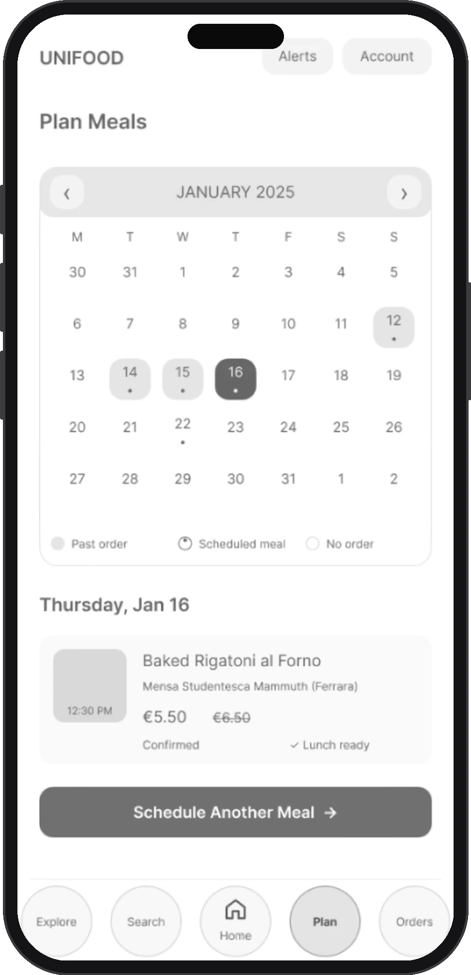
From the start screen to today’s discounts, straight to your meal plan.
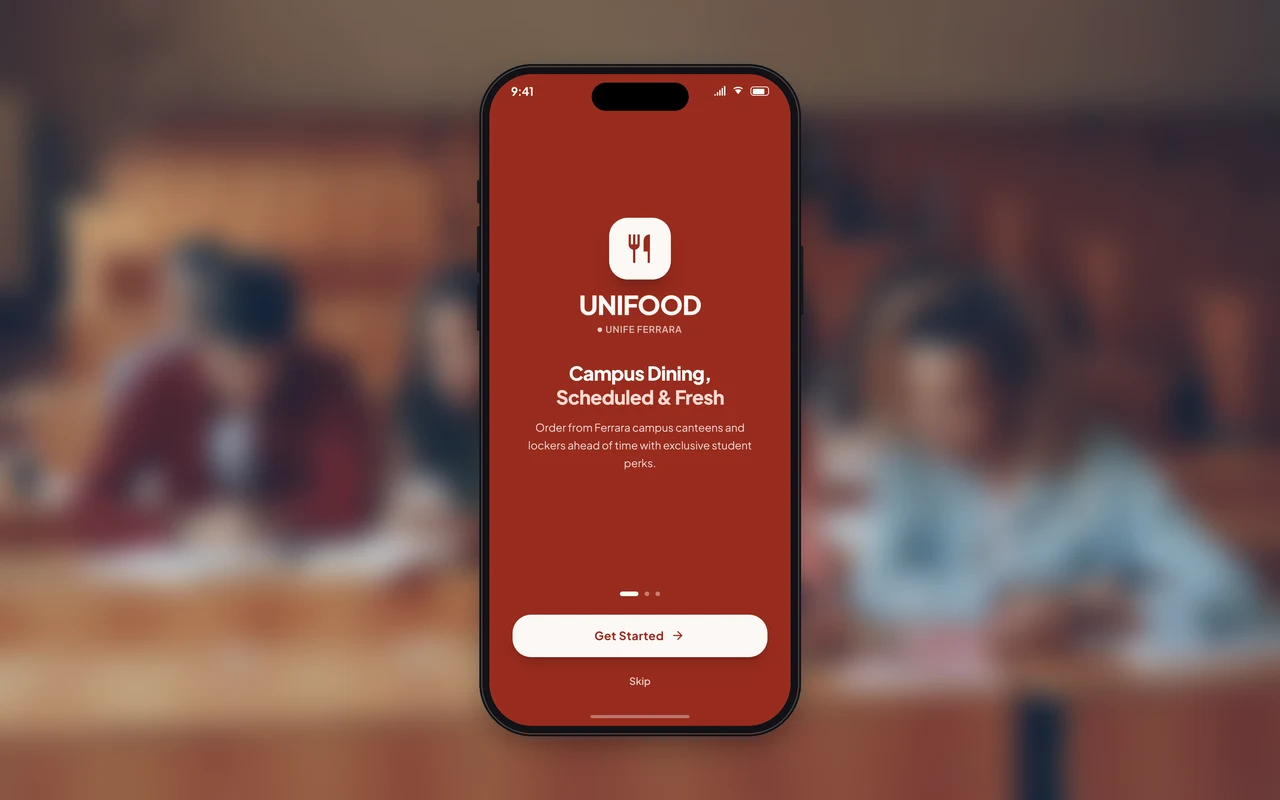
Switch between today’s order and your history.
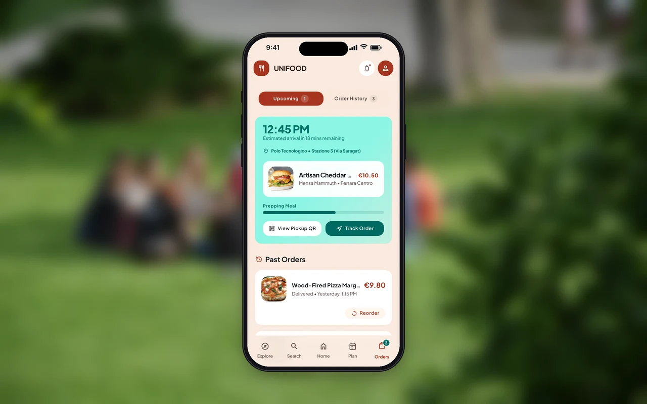
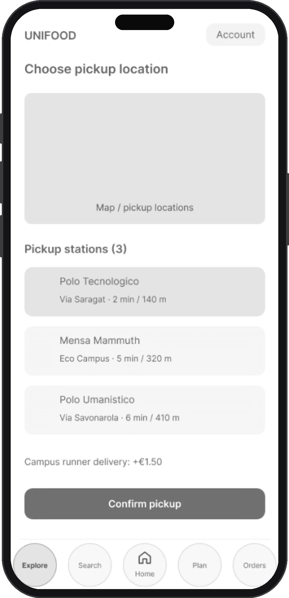
The rider drops lunch at pickup points on campus: choose the one nearest your lecture.
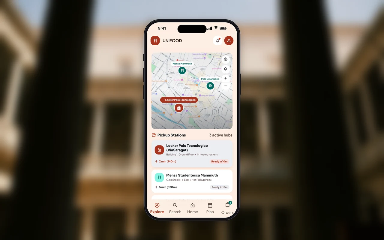
Screens and flows designed by our team in 2023. I designed the final UI in 2026 with Google Stitch, keeping the same flows.
The problem wasn’t the food: one hour isn’t enough to go and get it.

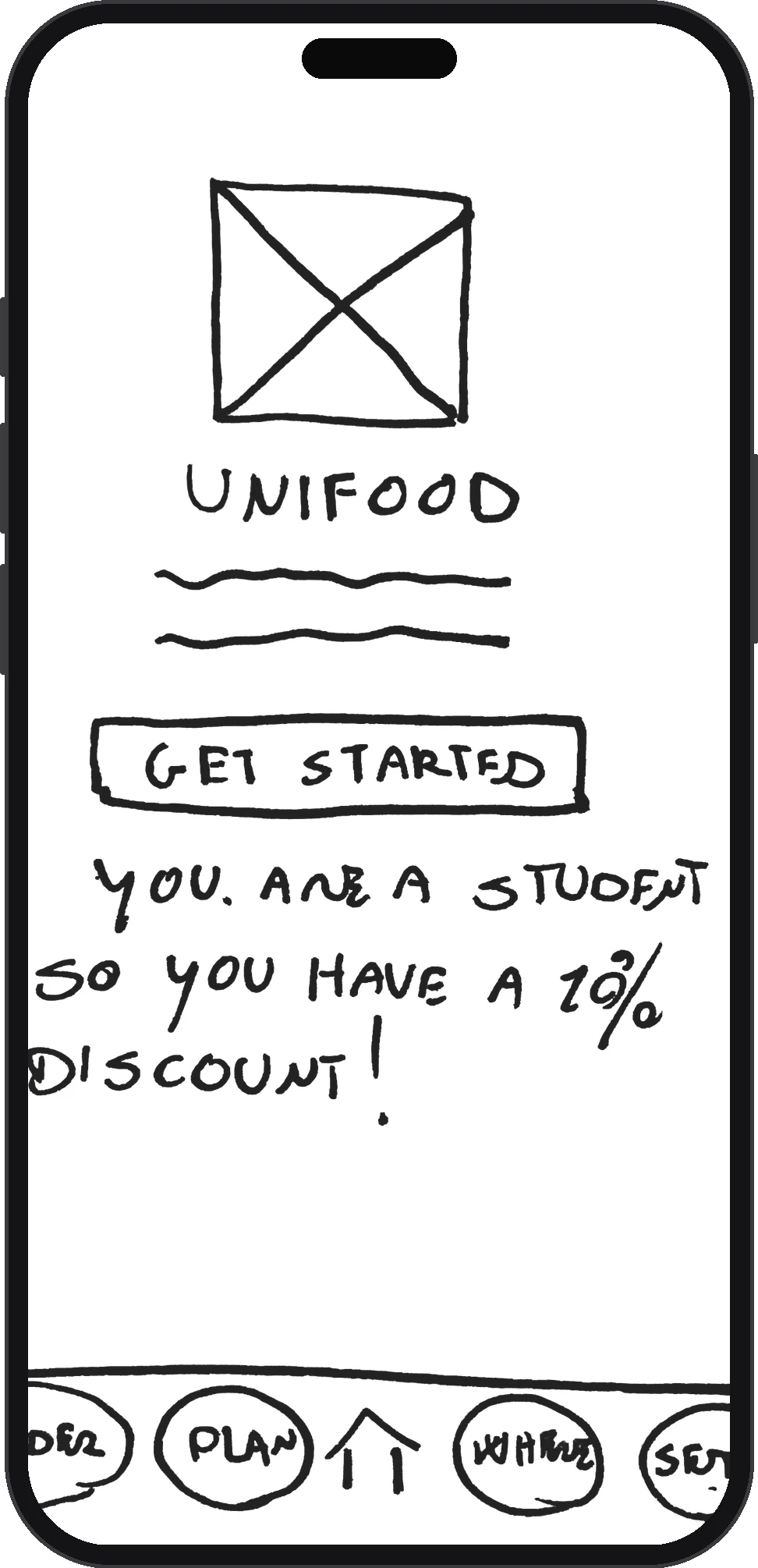
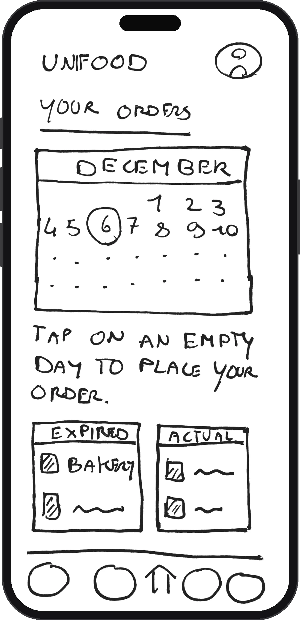
Canteen, deli, bakery or fruit shop
Discount if ordered in advance, or for yesterday’s leftovers
On campus, near your lecture
Everything, at 1 pm
Lunch arrives within the one-hour break.
Student discounts, and canteen and bakery prices that delivery apps don’t offer.
Leftovers from the day before are sold, and advance orders let sellers cook the right amount.
One collection round, and digital orders for shops that had none.


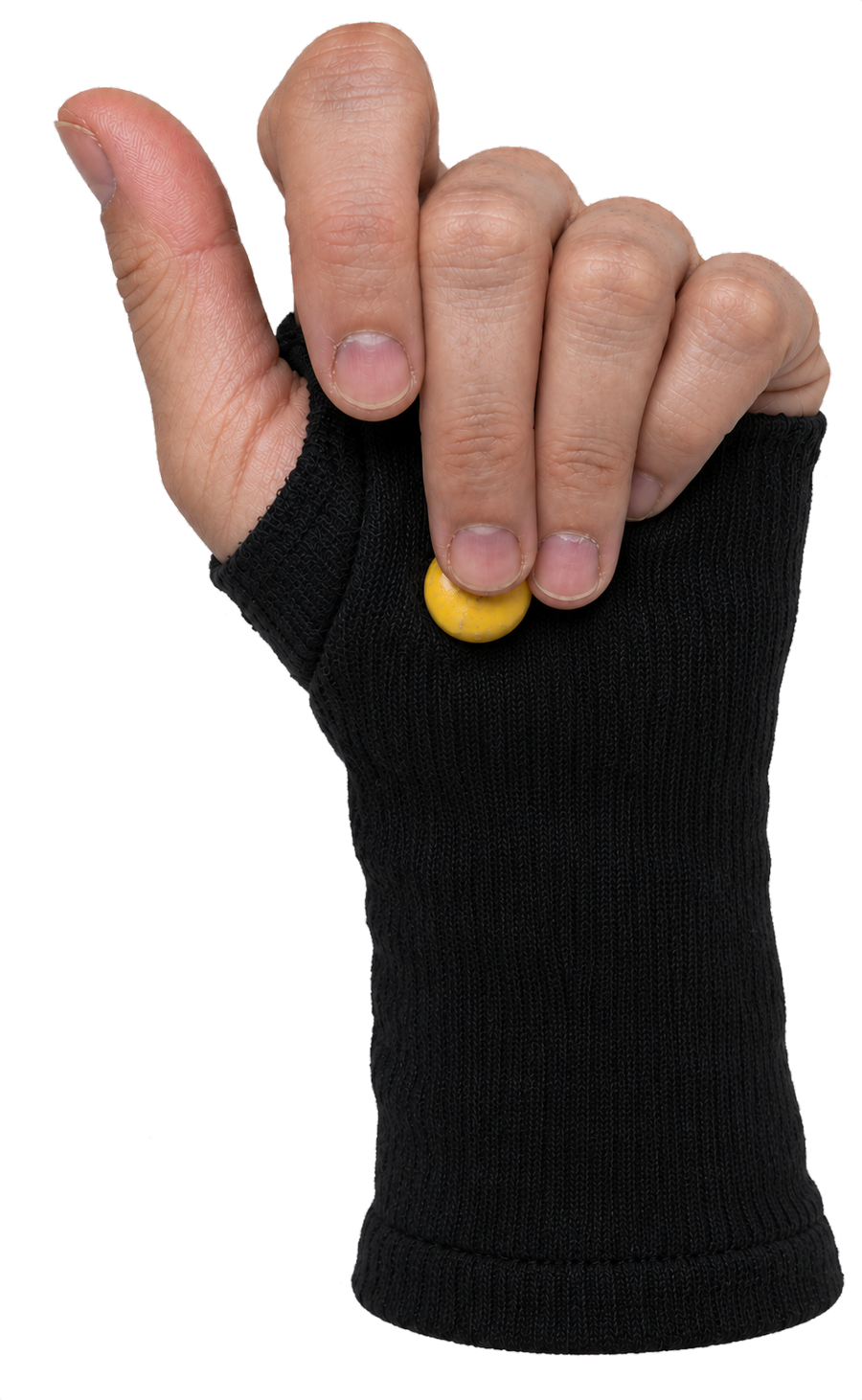
A glove that breaks the freezing reaction caused by panic
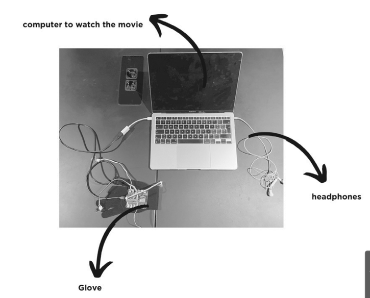
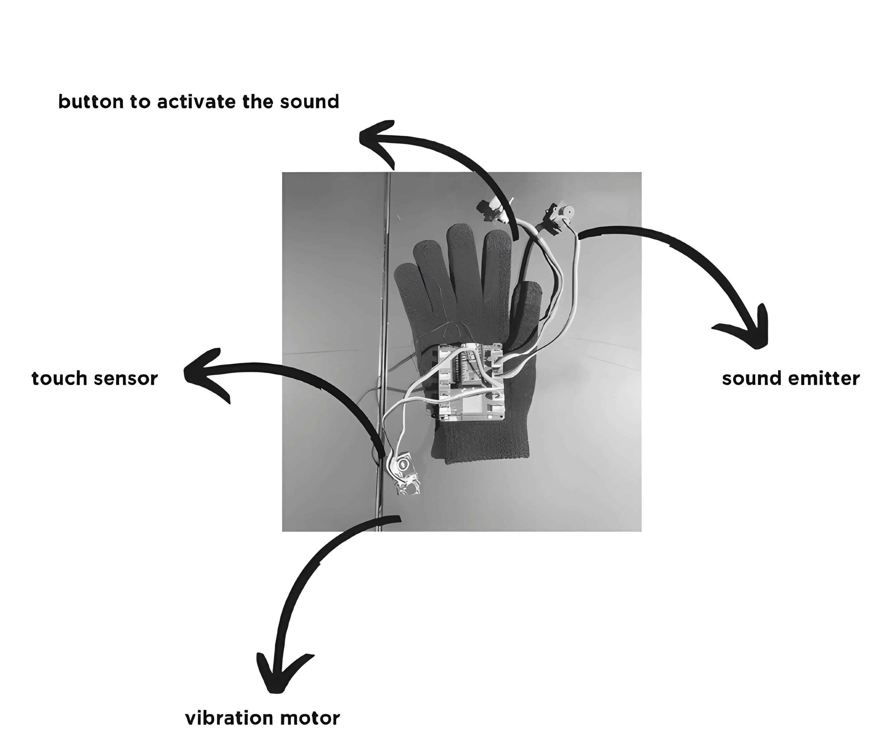
A running glove that senses panic, vibrates to break the freeze, and sounds an alarm with one press.

Photo, animated
When they experience harassment, many people’s bodies freeze. Self-protection products like pepper spray assume you can still act.
Solo. I led the whole project.
A hand-sewn prototype. The vibration pulled testers out of the panic, then pressing the alarm came naturally.
You can’t move.
You can’t speak.
You can’t ask for help.
of women runners worry about their safety
of women fear being attacked, vs. 28% of men
Source: adidas survey of 9,000 runners, 2023
How might a wearable help runners break out of the freeze and get help?


In a freeze you can’t act, so help has to start from your body, not from a decision.
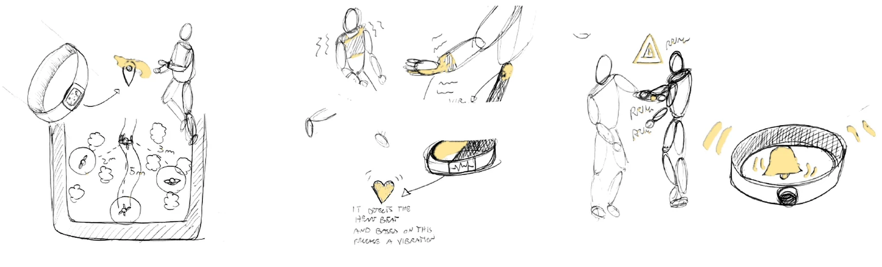
Alerts you when someone is within a set distance. Could be used to harm people.
Wakes you from the freezing state, with an alarm you can sound.
4 people | 10-min run
Glove felt safer; full glove too sweaty
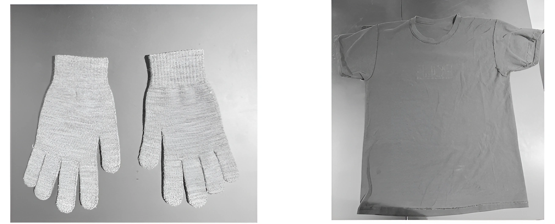
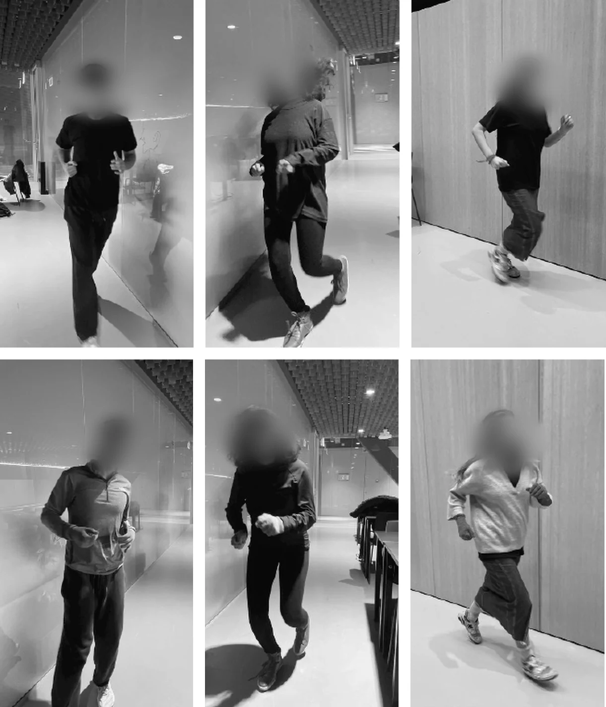
4 people | 15 min
Vibration worked best; sound and smell annoyed
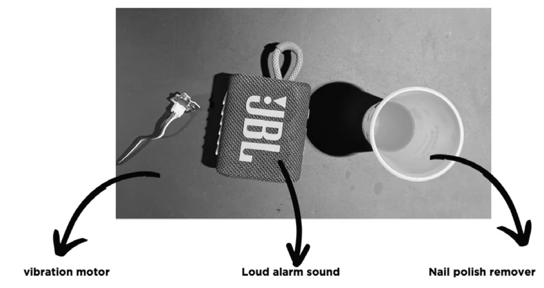
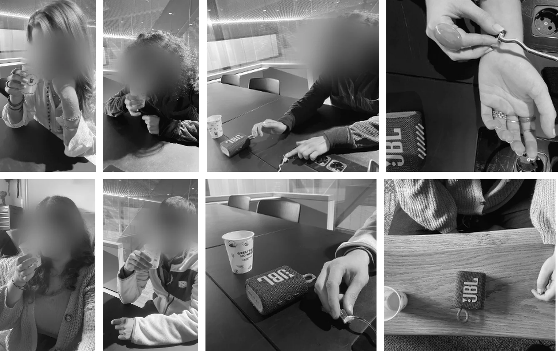
4 people | I triggered it remotely
Vibration distracts from fear; button goes in the hand
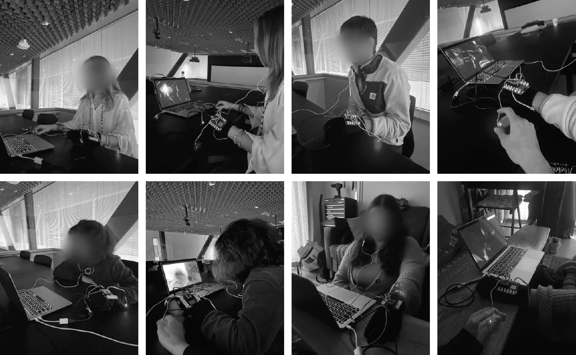
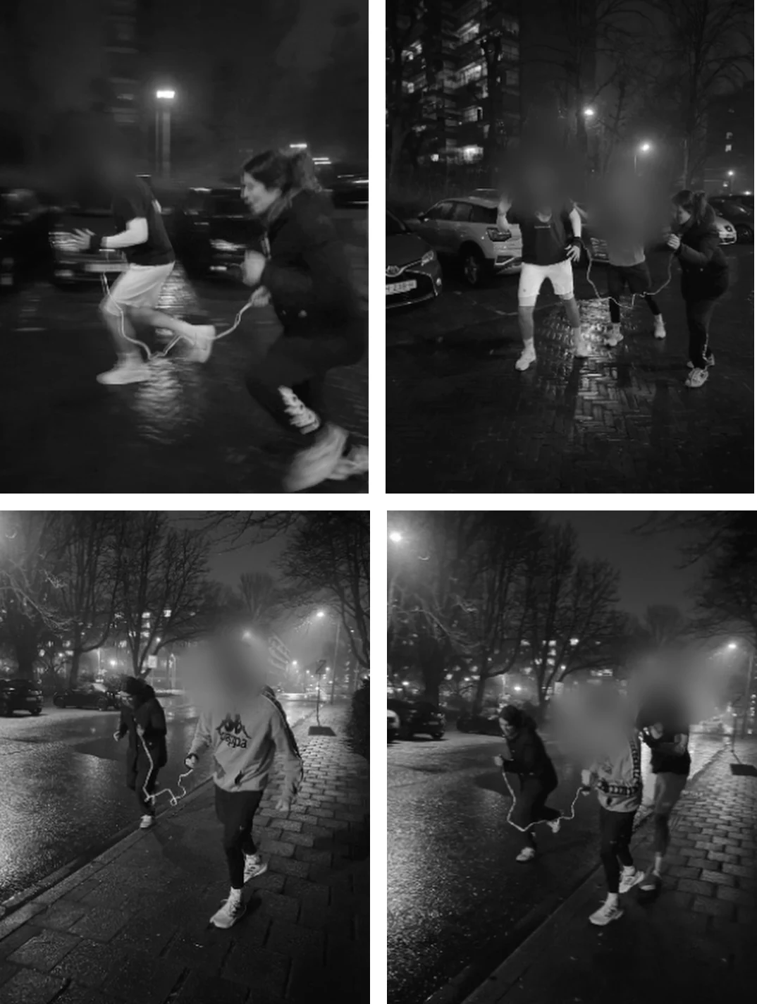
2 people | 30-min night run
Flashy reminded them of harassment
2 + 2 people
Pressing the alarm after the vibration felt natural
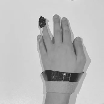
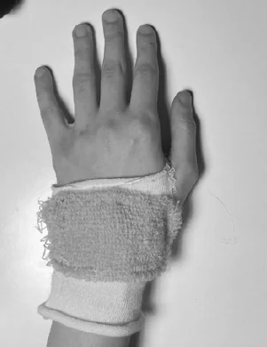
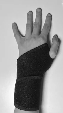
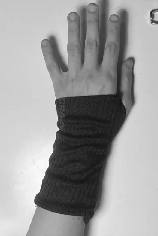

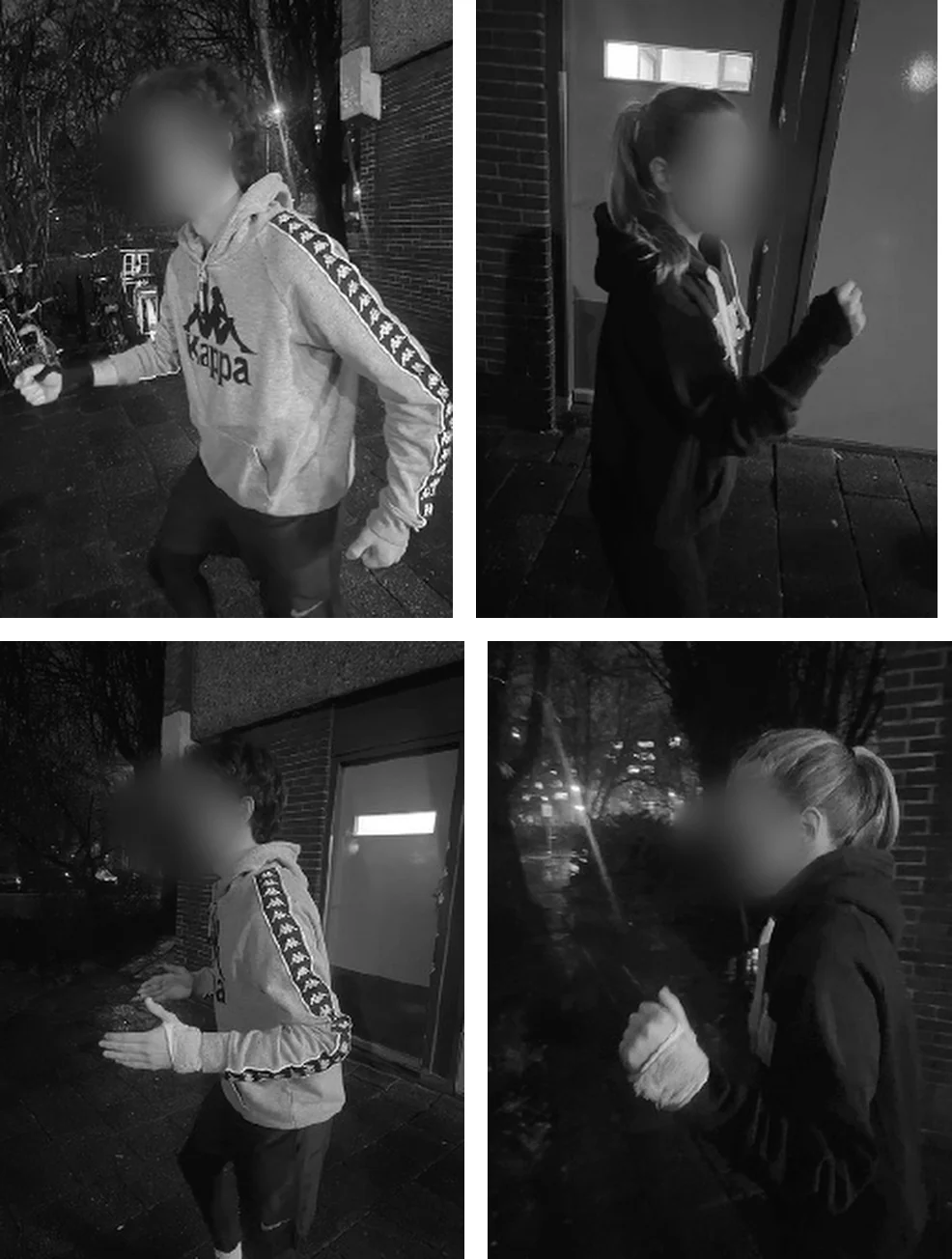
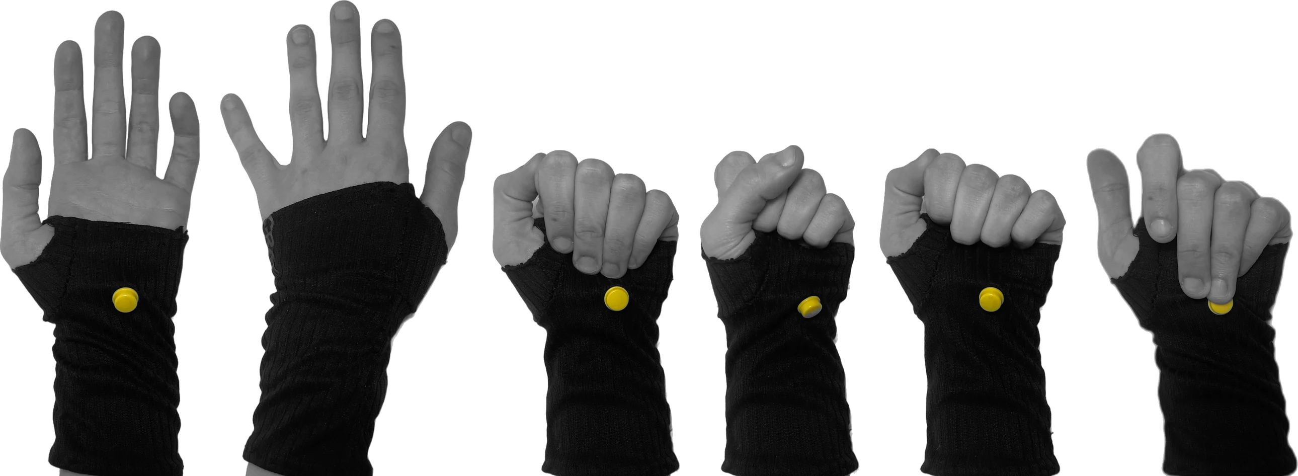
I studied the hand open, closed and gripping. The button sits low on the palm, where everyday movements don’t press it.
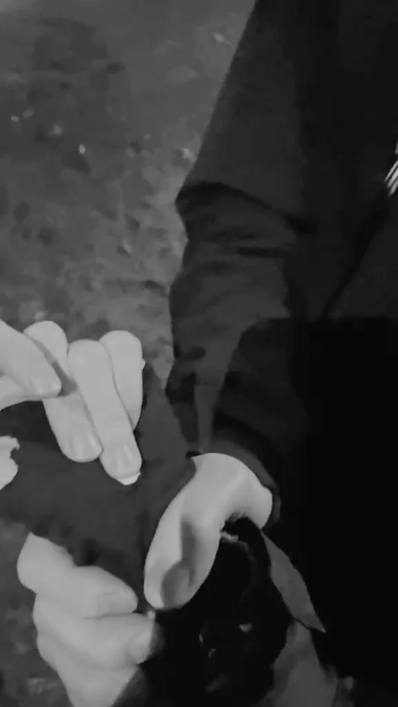
A runner freezes when a stranger gets close. The glove vibrates, she presses the button, the alarm sounds.
36 seconds, filmed with the hand-sewn prototype. Tap for sound.
3 possible outcomes after pressing the button
 This place is so creepy and dark, no one is around…
My body is not answering to me and my mind is blank… I CAN’T MOVE OR ASK FOR HELP!!!
What does this guy want??
I am regaining consciousness…
I have to alert someone, he is scaring me too much. Maybe someone else can help
the perpetrator runs away because of the sound
a third person comes because of the sound
the victim fights
Help people break the freeze, feel safer and call for help while they run.
Picks up signs of anxiety: faster heartbeat, sweating.
Synced with your health app, it knows your values at rest and while running, so exercise isn’t mistaken for panic.
On panic, the wrist vibrates on its own and wakes you from the freeze.
Able to move again, you can press the palm button with the same hand.
A loud sound alerts people nearby and can scare the aggressor away.
In the prototype: I triggered the vibration myself during the jump-scare tests; automatic sensing is the next step.

An award-winning tiny house that lets you live anywhere
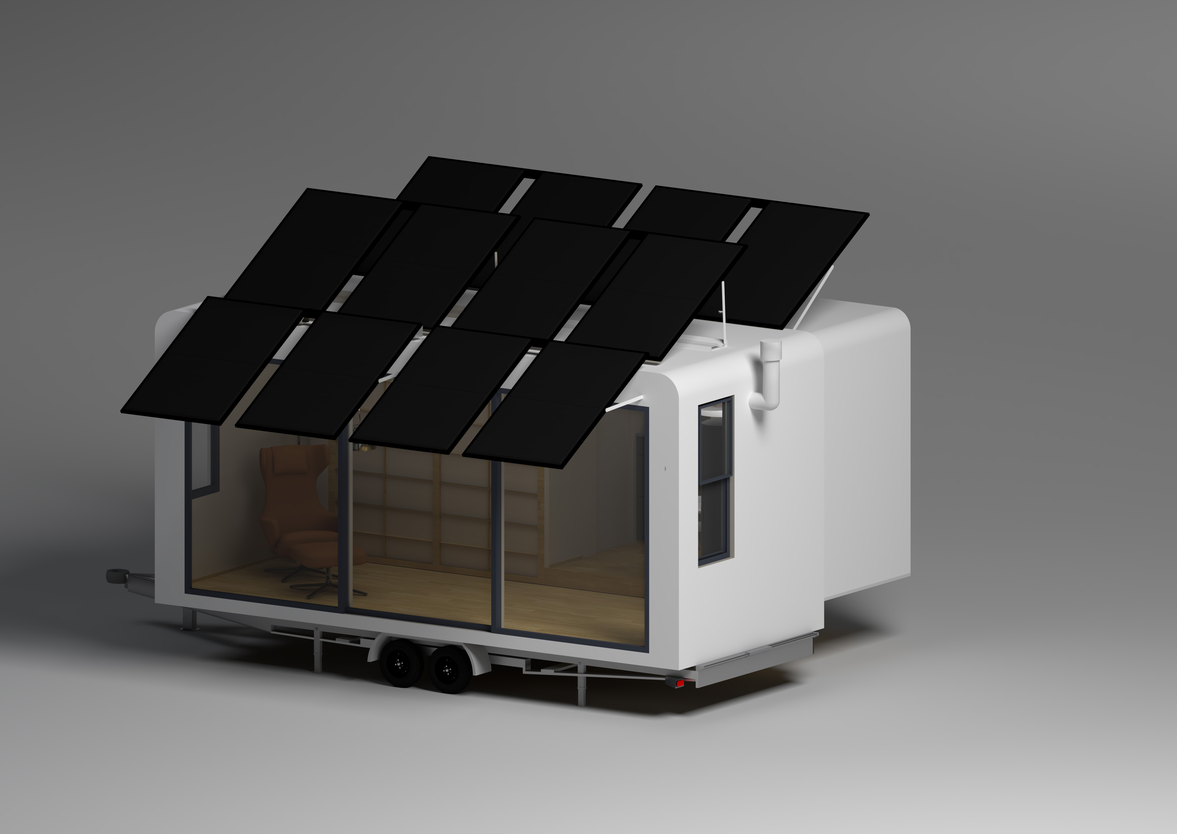
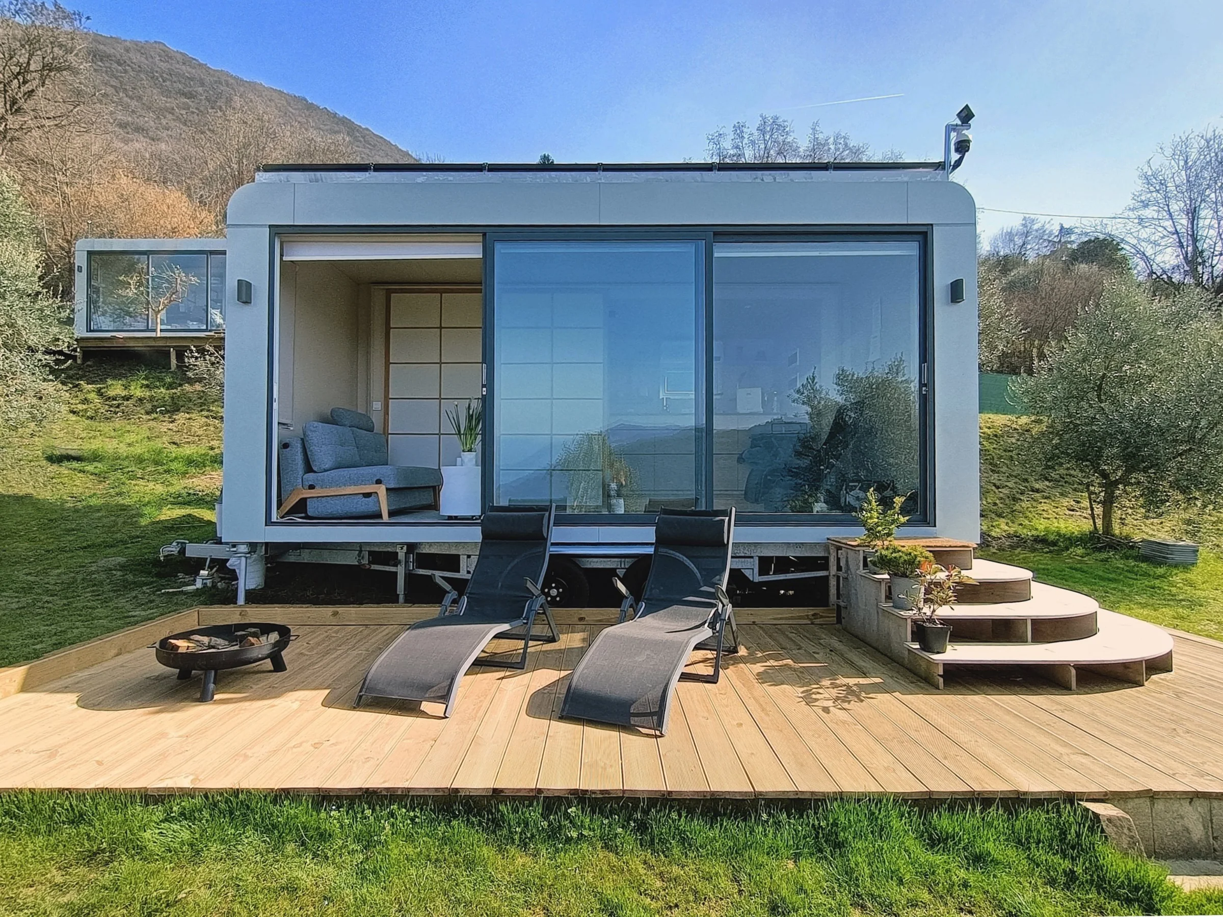
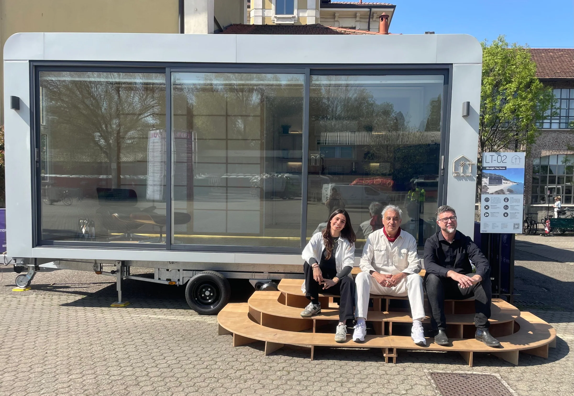
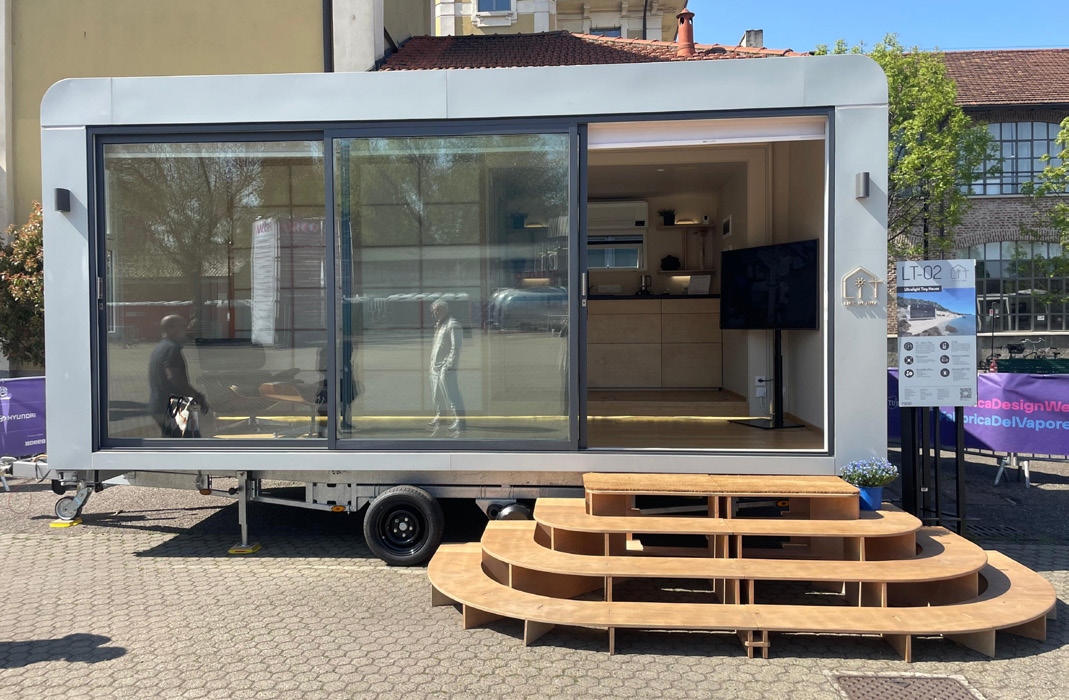
LT_02: an expandable tiny house you can tow with a car and live in all year.
Photo
Freedom to live and work anywhere, with the comfort of a real house.
The only product designer, alongside architects Matteo Bazzicalupo and Marco Olivieri.
A multi-use tiny house: a home for two, but also a showroom, office, emergency centre, clinic or gym. Winner of Design+ MIUR and Archè, honourable mention at the International Architecture Awards 2026 (Energy Buildings), shown at Milan Design Week 2025.
lifeintiny.com · Instagram: @lifeintiny_
LT_02 travels on a trailer, sits on floating piers or stands on the ground, with real-home interiors.

LT_02 travels on a truck and is lifted into place by crane. Once it arrives, it takes about an hour to install.
Video by Nicola Belotti and Luca Turelli for Life In Tiny. Tap for sound.

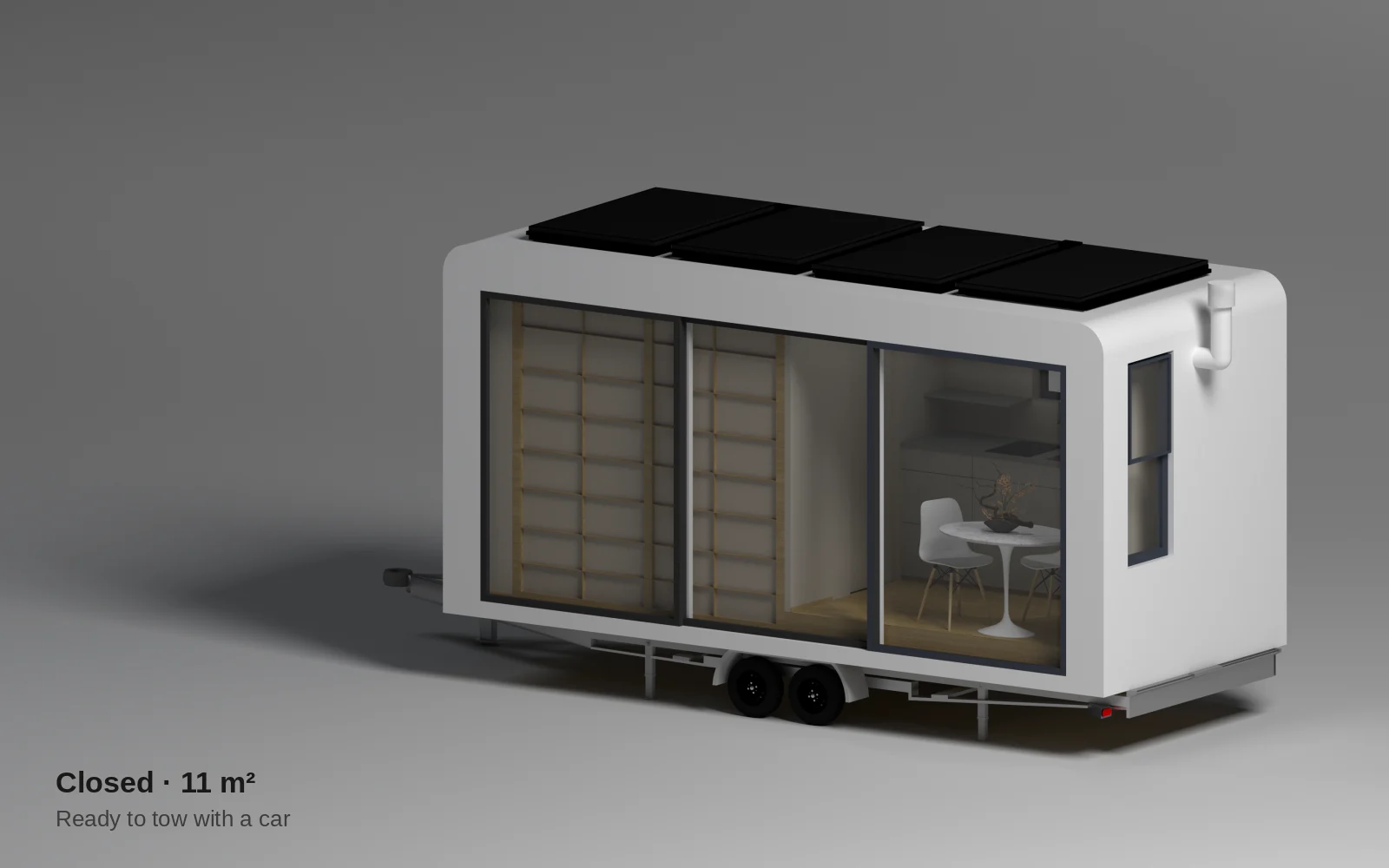
closed, ready to tow
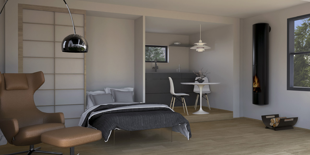
open, a full home for 2
under the 3.5 t towing limit

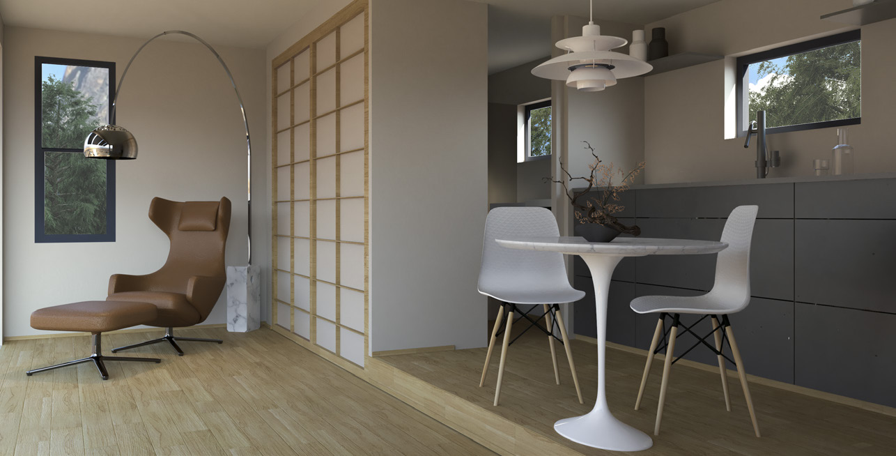
Living area, kitchen and bathroom. A Murphy bed and sliding panels turn the living room into a bedroom.
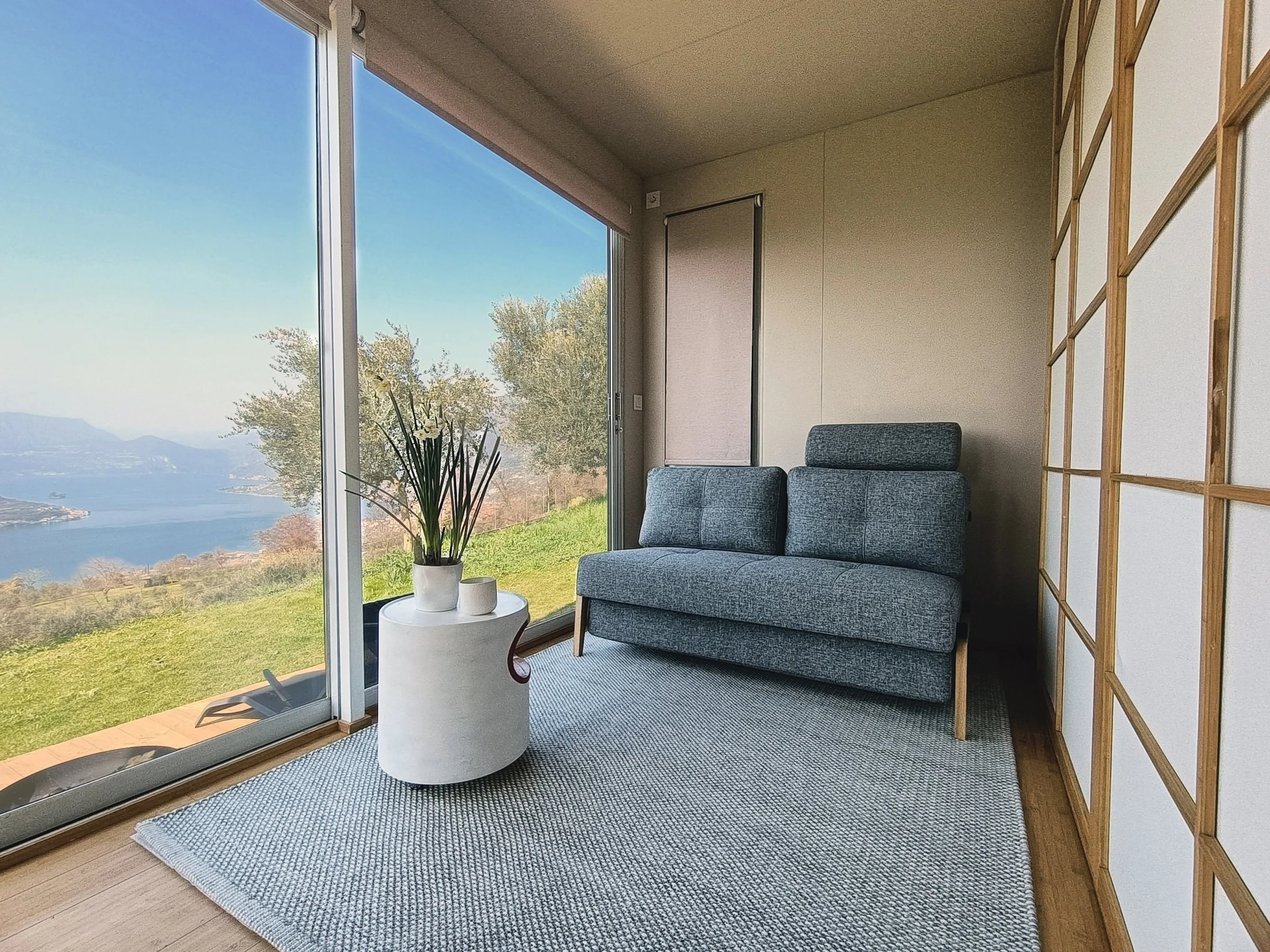
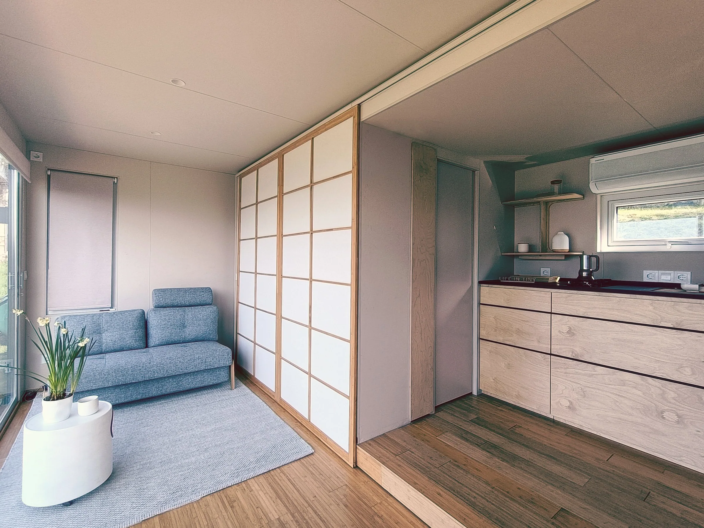
No walls or furniture inside, basic grid electrics. A shell to fit out freely.
A+++ heat pump, water tanks, compost toilet, custom colour.
Solar panels with storage, off-grid electrics, weather station, platform and steps included.

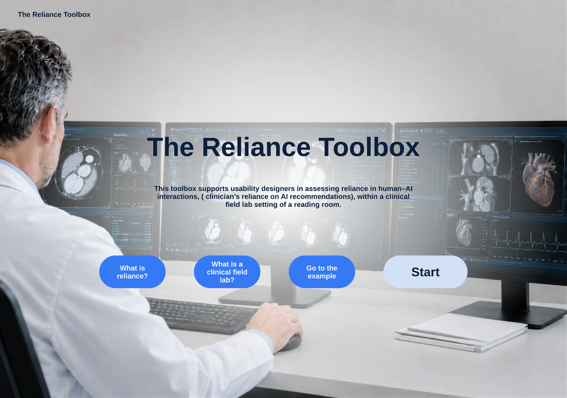
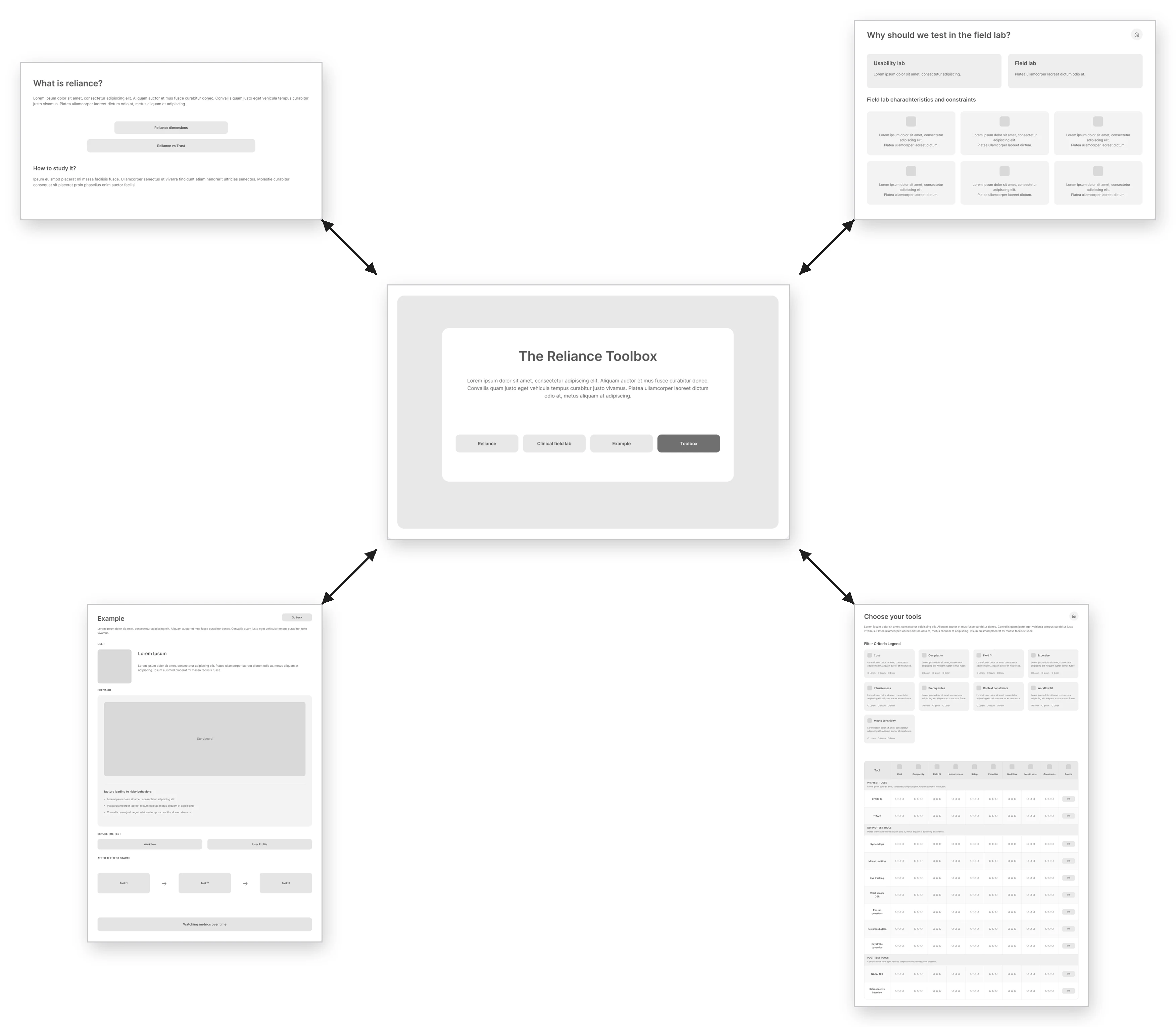
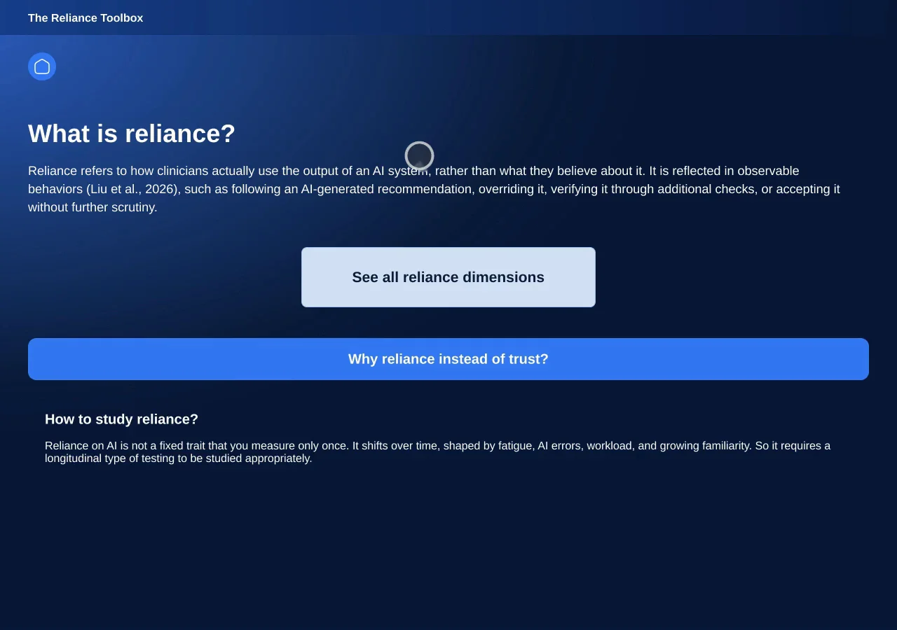
A method and clickable toolbox to study how doctors rely on AI
An interactive toolbox for Philips usability designers who test medical products with users.
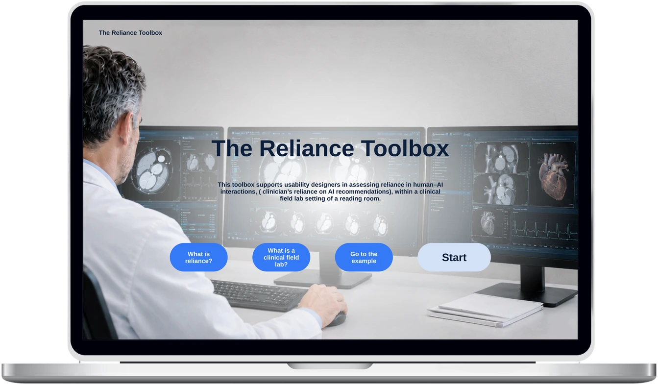
AI helps doctors diagnose but is never 100% right. Usability designers had no method to study how much doctors rely on it.
Solo. I led the whole project.
A method and toolbox for tests inside the hospital, tested with Philips usability experts.
AI can be wrong. What matters is what doctors do with it, and that changes over time.
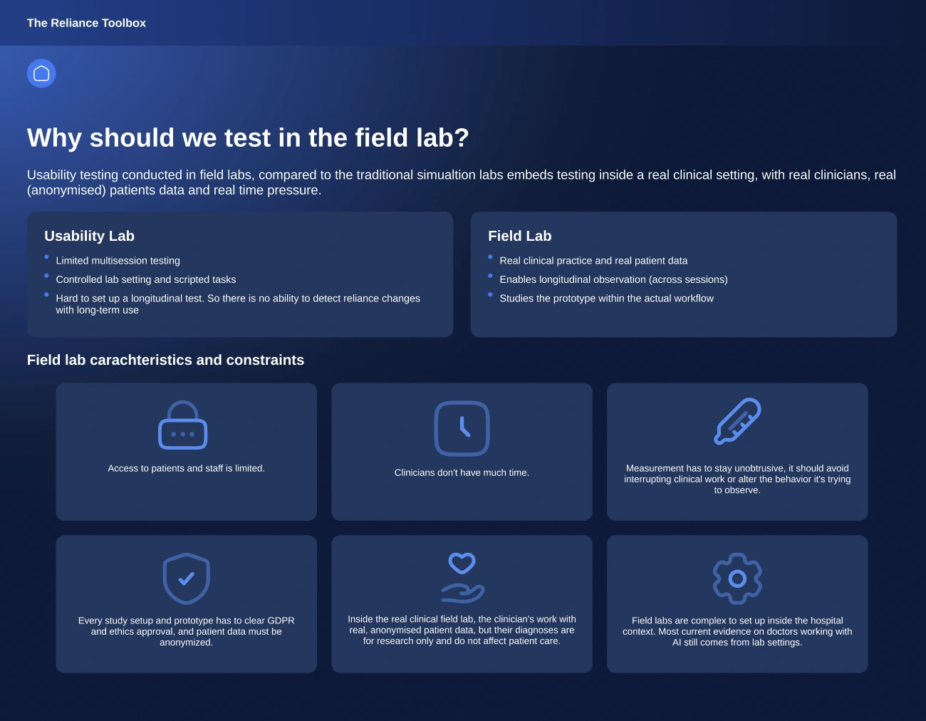
Long hospital studies are hard to run.
One lab test can’t show how reliance changes over time.
How might designers test, over time and in a real hospital, how doctors rely on AI?
Learn the basics, or jump straight to a table of tools you can filter.
Tested with Philips usability experts in two rounds. The team now plans to use it in a real usability study.
Every tool side by side on 9 criteria, grouped before, during and after the test.
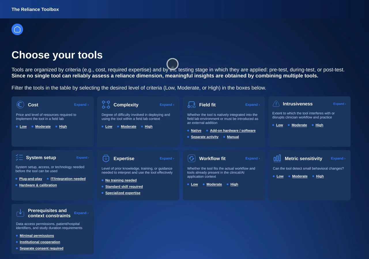
Designers needed guidance and suitable tools, not another tool.

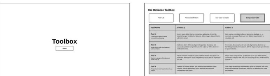
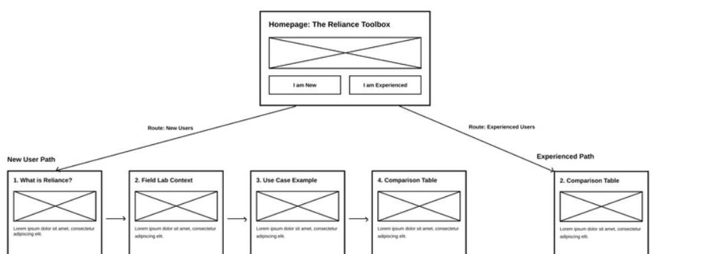
experts tested my concepts: 4 Philips usability designers, 1 researcher
rounds of expert testing
real hospital test ward studied from the inside, plus research papers
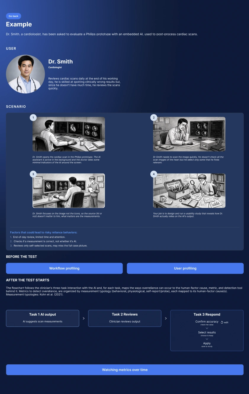
Let designers pick their own tools, with guidance and a real example, not fixed steps.

A calming companion for ER patients
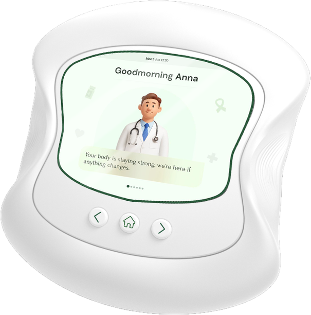
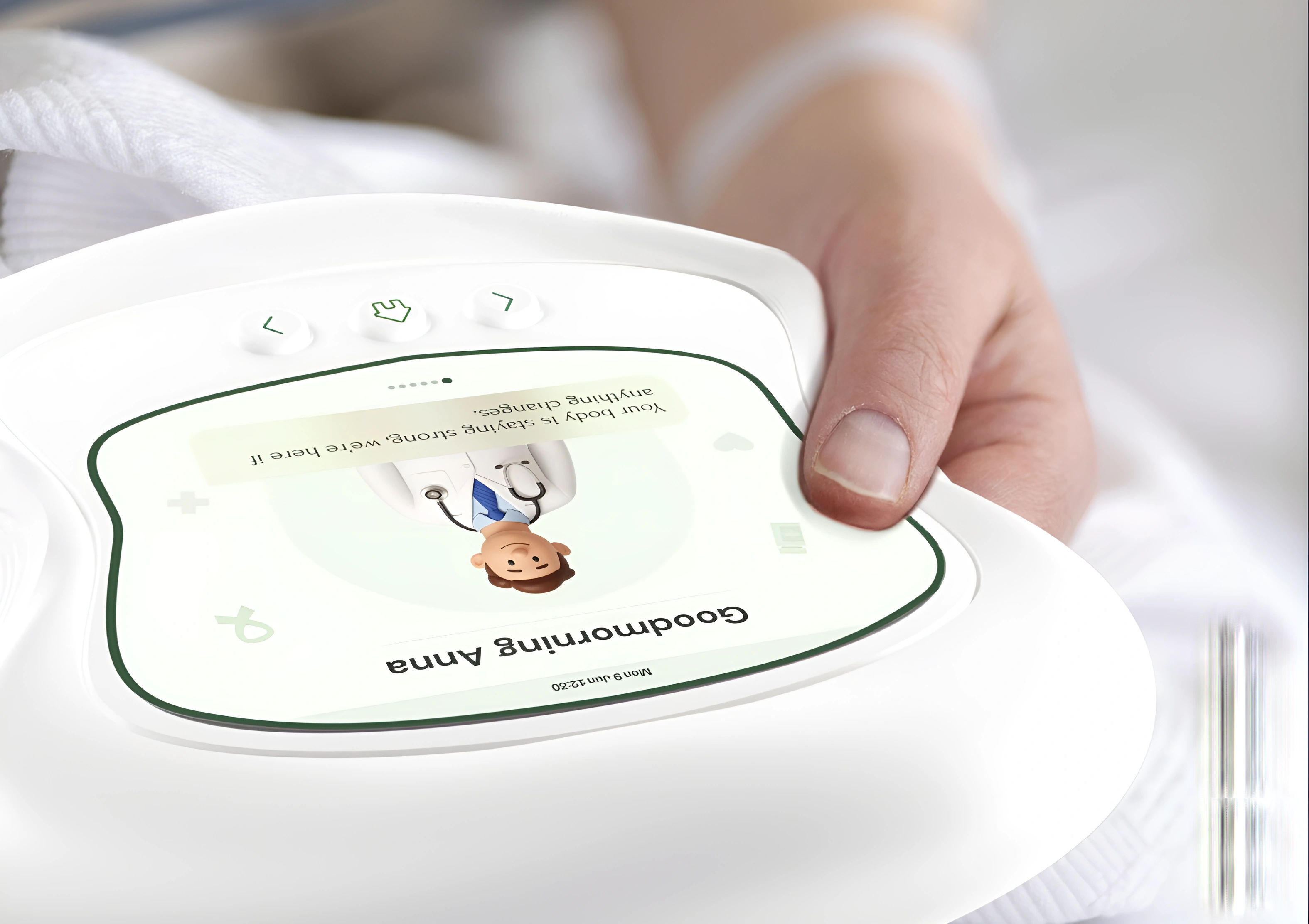
A device for ER patients that hangs on the bed rail and explains their vitals through screen, sound and touch.

Render
ER patients wait alone for hours next to a monitor that beeps, but that they can’t read.
Team of 4, with Erasmus MC. I led the testing.
In the final test, people felt watched over and calmer, and showed us what to fix: meters and colours.
The machine meant to protect them scares them.

How might we help ER patients feel safe and in control while they wait?
Hang it on the bed rail or lift it off: squeeze, touch and tap to see how your body is doing.


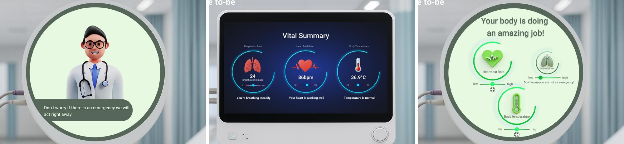
Three early screen styles, tested with patients.
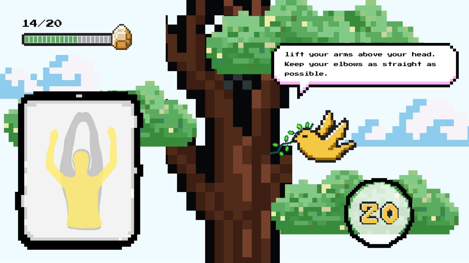
Wall exercises tracked by a camera. Interviewees said they’d soon get bored, so it wouldn’t ease anxiety.


Worked: they felt watched over; icons, short texts and a kind tone on bad news calmed them
Didn’t: the green smiley looked like a sick emoji; the meter and all-green colours confused people
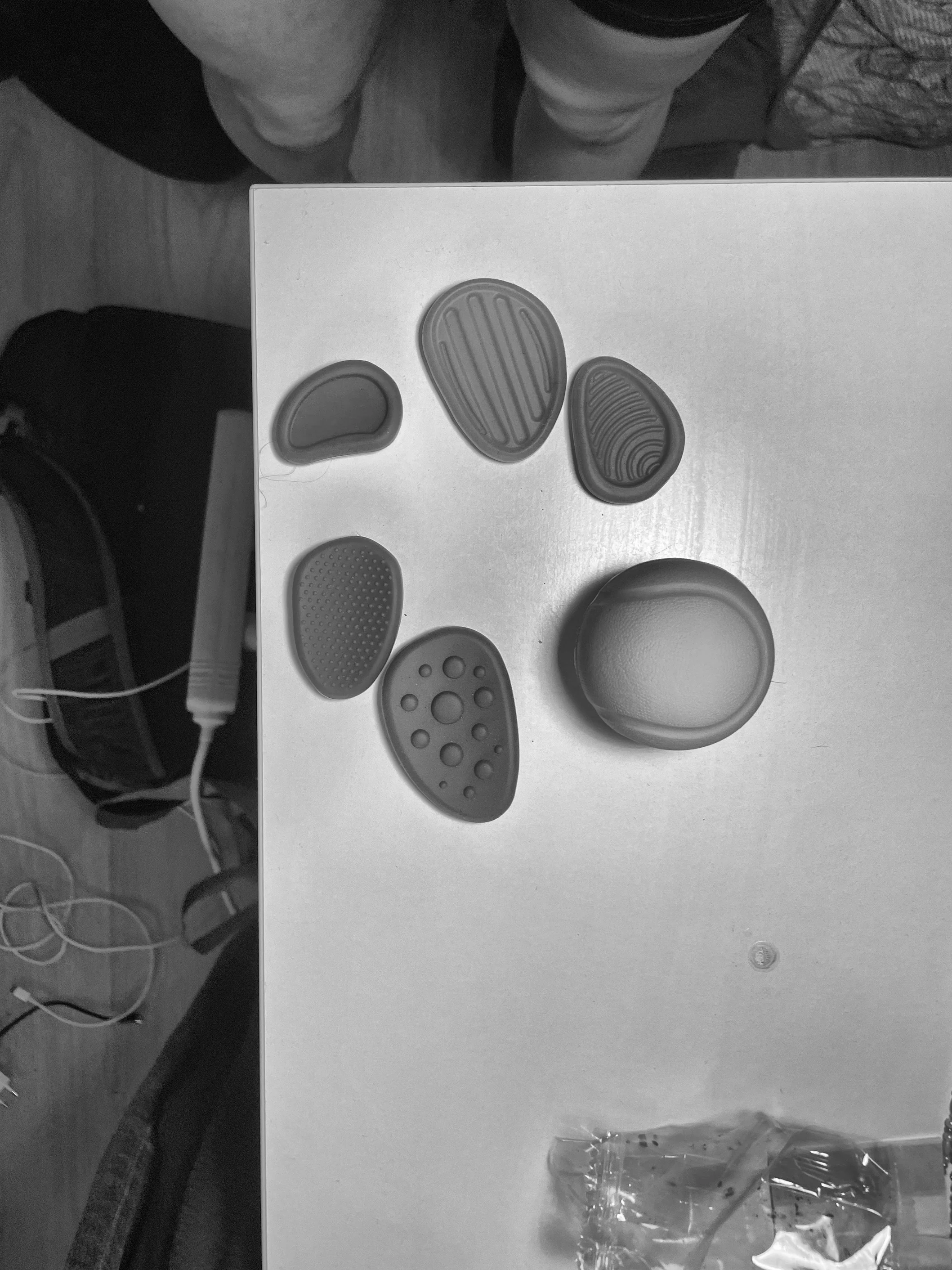
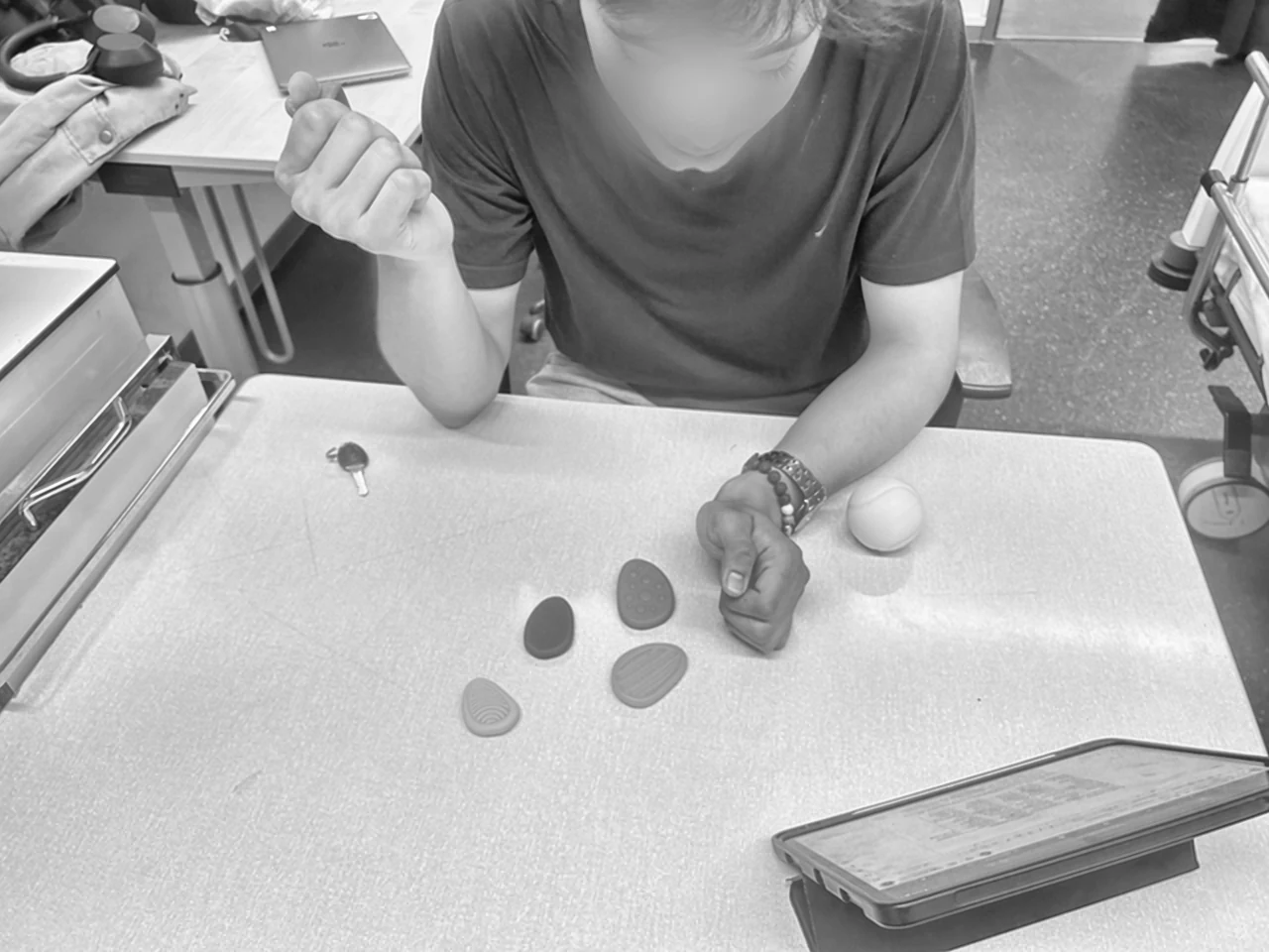
Bubble and ridged textures, taken from anti-stress toys on the market, were preferred: touching them distracted the body, stuck in bed, and eased anxiety.
Show only what patients care about, explain it calmly, and tell them when they’re okay, without hiding anything.
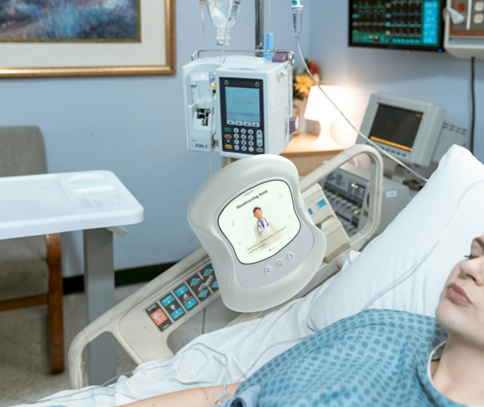
Hangs next to the hospital monitor
Shaped to be held in both hands
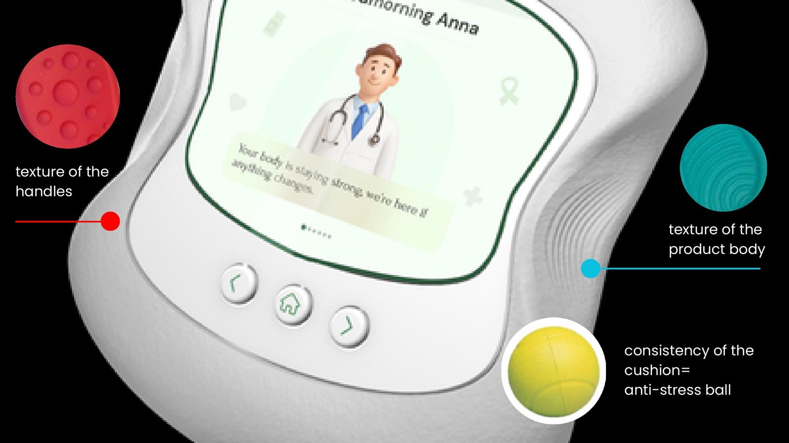
Squishy cushion, bubbly grips, ridged sides: textures that calm and help focus

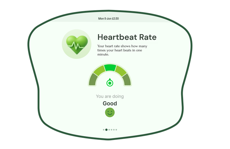
The avatar greets the patient, green meters, calm, relaxing sound
A gentler message and a yellow note: “You’re being looked after”
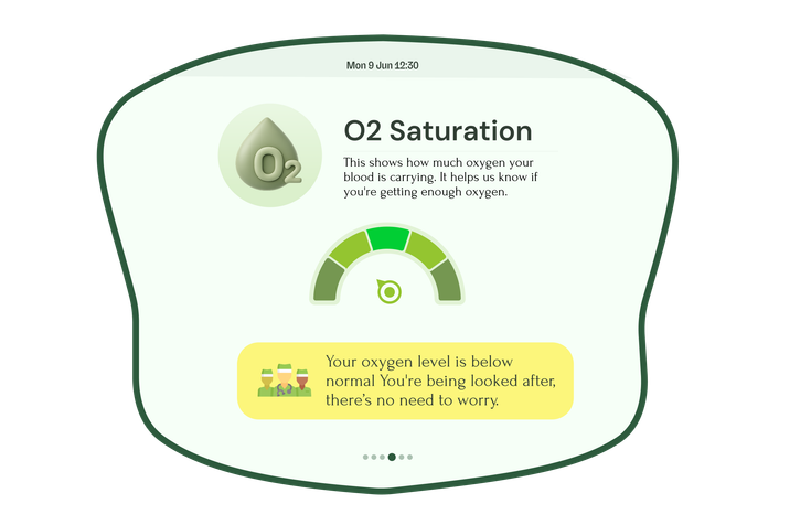
Only now does the beeping start
The back, home and forward buttons flip through heart rate, oxygen and temperature.

Walking together, not just for money
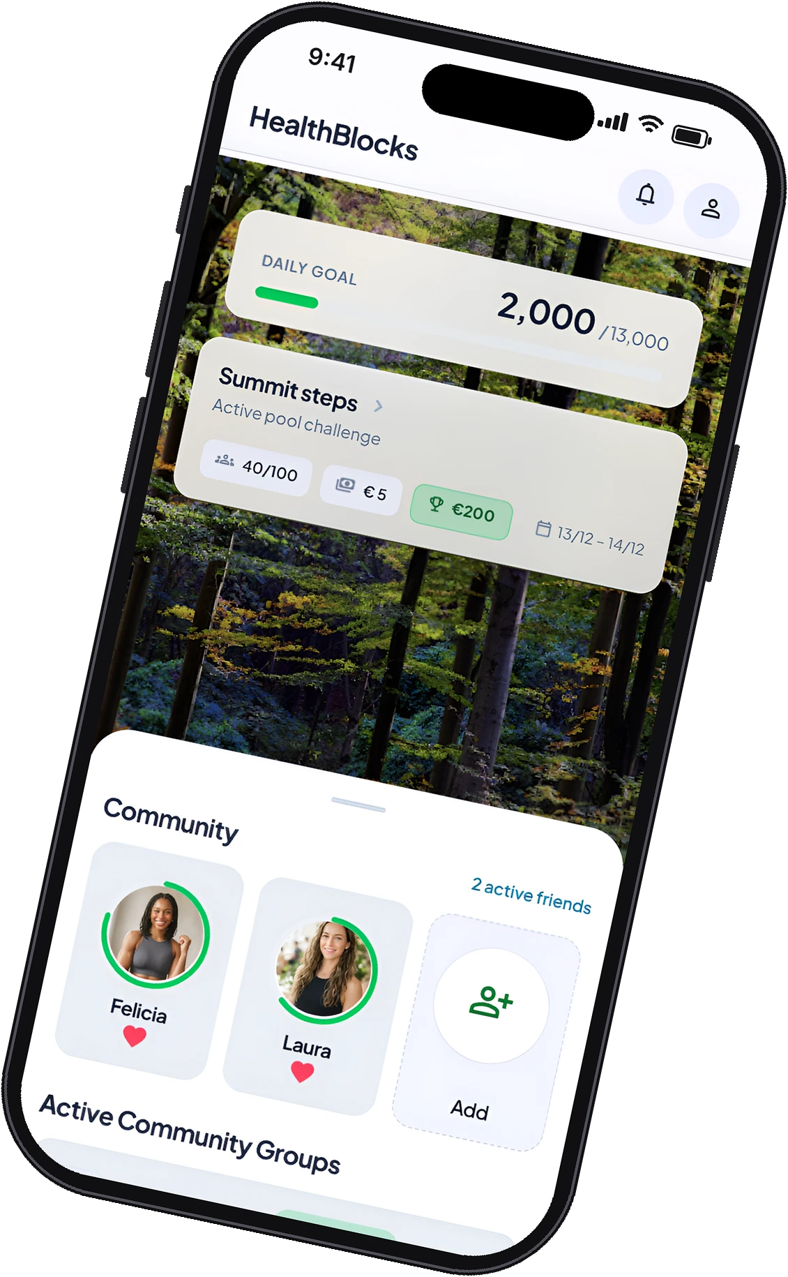
A step-challenge app redesign: a community and a second currency, hearts, to bring in more women and keep people moving.
HealthBlocks pays you to walk: join a step challenge and win back your fee plus a share of the pool.
Duo project with Veronique Serné. I led the research, persona and journeys, and worked on the hearts system and the UI.
A second reward next to money: hearts, earned by supporting others. Money still comes only from walking.
Competition and money are traditionally masculine motivators.
But motivation depends on identity, social context and life experience, not gender. So we designed for women aged 20 to 45 without stereotypes.

How might we grow HealthBlocks and attract more women, while keeping people active for the long term?
Same challenges, reframed as a shared journey: summits instead of rankings, groups instead of leaderboards.
Daily goal and Summit steps on top, your friends and groups just below.
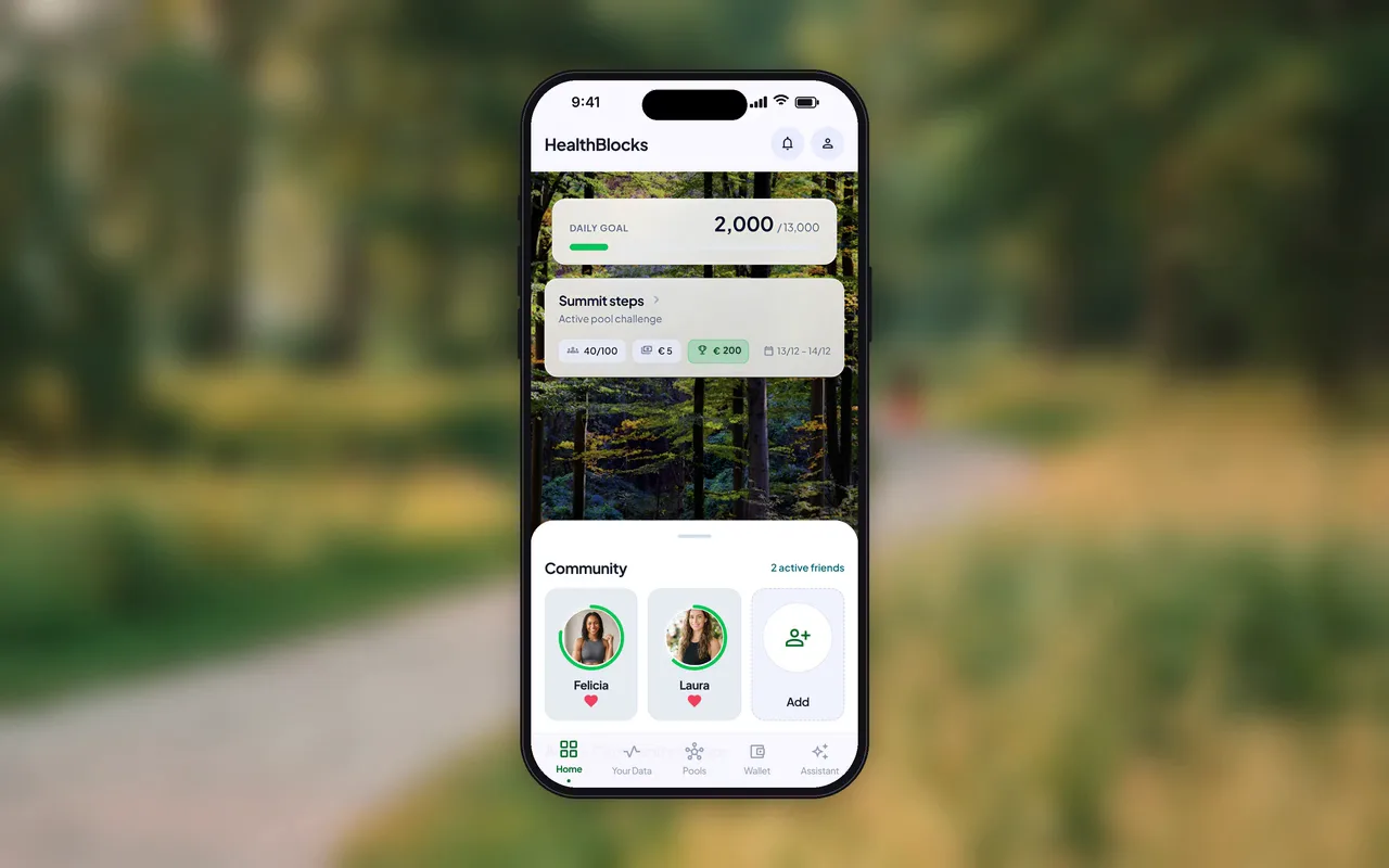
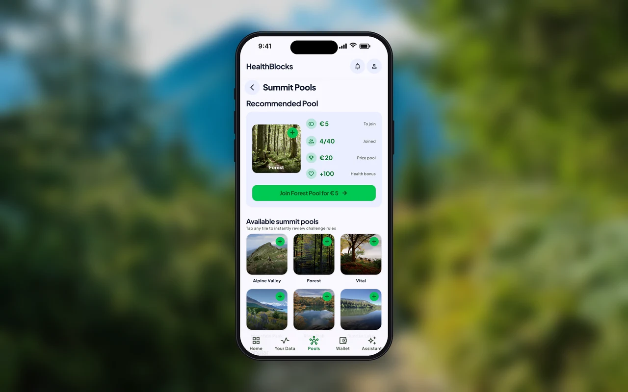
A recommended pool explained up front, then popular and community pools.
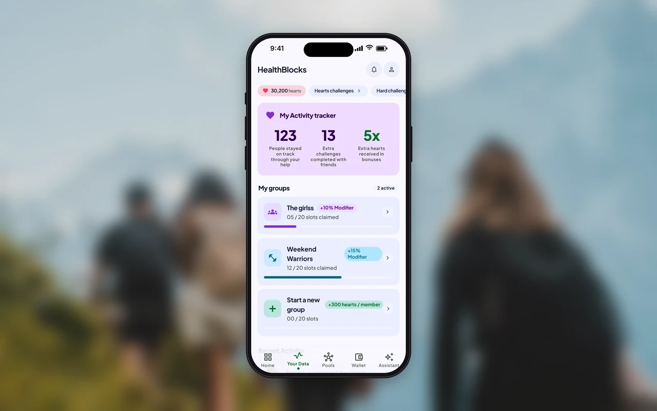
What the group achieved, your groups, and what friends did today.
Veronique designed the first UI. I refined it, partly with Google Stitch, and we moved from black to a bright palette.

She loves doing things with others and wants to move more, but only keeps it up when others are involved.
Money doesn’t motivate her. A supportive group does.
Money gets people started. A community keeps them going.
“To increase user growth by facilitating a sense of community.”


Money for moving, hearts for helping: social value supports physical effort, it never replaces it.

One long list of pools, each a big card with dates, entry fee and prize.

A recommended pool explained up front, then popular and community pools to choose from.

One recommended pool to join in one tap, then nature, popular and member-made pools.
No leaderboards: your hearts, your groups and what you achieved together.
Communities don’t form because people can talk. They form because people need each other to make progress.
